October 02, 2020

LAS Handbook

Earlier this year Lancaster Archery distributed a new employee handbook. I was tasked with working with HR to create and source a printed product. I worked with a local print vendor to get estimates on several different booklet options. 

The final product was an 80 page 9" x 12" spiralbound booklet. The text pages were black and white to keep it cost-efficient. The cover was a heavier paper weight and full color. The inside back cover features a pocket to allow for employees to add additional handouts of policies as they happen throughout the year.

The cover was definitely the place where I was able to be the most creative. There were some design elements incorporated within the book, but primarily it was simply neatly set text. I had looked at several different sources for cover inspiration prior to landing on the below.


For the cover, I knew I wanted a collage of images. I wanted to include a photo that represents the size of the company. I also wanted to include various photos of people within different departments - some candid, some not. I also really like when color runs from the front cover and onto the back cover. Also on the back cover I wanted to include the LAS tagline "Leading the World in 3D & Target Archery."


September 24, 2020

2020 Lancaster Archery Classic Patch

Last January, Lancaster Archery hosted the 2020 Lancaster Archery Classic at Spooky Nook Sports Complex. The event was a huge success again, but like any event, it took a lot of time and effort. Each year we design a new event t-shirt and hat. I had come up with a design that worked very well for a patch hat and sticker. Below is the black and white of the final version.

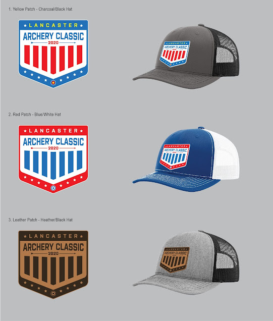
To finalize the design, we went through a few color variations. Overall I wanted to focus on red, white and blue. 2020 was to be an Olympic year, so I wanted something that felt patriotic and somewhat represented the USA. Not to mention, the red, white and blue color scheme lines up well with the archery target colors and the LAS logo. Below were the final three designs I had proposed.

The second design was preferred, but the small target on the bottom was changed to the blue, red and yellow rings to stay true to the targets used at the Classic event. 


As of now there are still some hats available at https://www.lancasterarchery.com/2020-lancaster-archery-classic-hat.html 

September 22, 2020

CompetitionArcheryMedia.com

Competition Archery Media (CAM) is a brand created to broadcast live archery events. Last year I created a Squarespace site for CAM and it has since grown to what it is now. There is still room for additional growth, and Squarespace is an easy platform to handle those changes.

One of the main tasks was to highlight the sponsors, with the focus of course being on the platinum sponsors. Therefore, they are featured towards the top of the homepage and also on the Sponsors page. 

Another important component was the event schedule. Once the 2019 schedule was completed, the page seemed very outdated. To make it more interactive, I went and added images and video playlists of the past events, so if visitors came to this page they had more interesting content. 

An advertising page became very important when wanting to gather sponsors for the 2020 archery season. This page was added along with updated sponsor packets I designed. These downloadable PDFs include the same website branding and colors. They also include images and examples of what each sponsorship level receives. The analytics PDF is a recap of the 2019 season, again using the same design elements to keep the brand professional and consistent. Below is a grid of the 2019 analytics summary.

The Squarespace template offers a seamlessly responsive website to be easily viewed on desktop, mobile and tablet. View the current website here: https://www.competitionarcherymedia.com

September 04, 2020

LAS Apparel: Align Hoodie

I can't say this enough... I LOVE apparel design! 

Each year LAS likes to launch some new t-shirt, hoodie and hat designs. Last year I worked on a hoodie design that I wanted to be modern, have a focus on typography and have some American design elements included. 2020 was meant to hold the Olympics, so I thought including an American theme would be appealing to our American archers.

I started with a large blank canvas in Adobe Illustrator. Utilizing different sans serif typefaces, I began brainstorming by typing out Lancaster Archery Supply and other taglines, phrases and related information. I incorporated the target, stars and the American flag in these sketches. Overall I was breaking away from the Lancaster Archery logo, while still designing with the brand in mind.

I landed on the below mock that was eventually approved by the appropriate stakeholders. This design loudly states "Lancaster Archery Supply" with an intentional focus on "Archery." "Established in 1983" is much smaller but knocked out of a white block background to provide balance in the overall design. Underneath features a flag with the company location, while intentionally emphasizing "USA."


Then came the time to source a hoodie. While using a local screen printer, I confirmed I wanted a royal blue hoodie to stay consistent with the LAS colors. At the time, LAS didn't have a bold blue garment for sale like this one, so it added variety to the apparel line. By having a bold garment, I was able to successfully use a one-color design to reduce cost overall.

After getting several hoodie samples from our screen printer, we decided to go with the Independent Trading Co. SS4500 Mens Midweight Hooded Pullover Sweatshirt in Royal Blue.


Once the hoodies were ordered and received in inventory, our in-house photographer used an in-house employee as the hoodie model. Our eCommerce team added the image and description to the site, and I included the new product in the 2019-2020 LAS catalog.


This hoodie is available for purchase on the Lancaster Archery website: https://www.lancasterarchery.com/lancaster-archery-supply-align-hoodie.html. It is definitely a design I am very proud of and pleased with the final design!

September 03, 2020

Galaxy Bow International Ad

Galaxy archery is a house brand of Lancaster Archery Supply. We primarily advertise the Galaxy brand overseas in the UK publications. For years, LAS and Galaxy have been a loyal advertiser in Bow International magazine. When I joined LAS, we had been using an ad for several issues in a row that overall was quite dark. When I saw the printed ad, I didn't love how the blacks weren't as dark as intended. Therefore, I decided to lighten the design up overall. 

The primary focus is to advertise the Galaxy Solstice riser. I wanted to provide more description and text in this ad than had been used before. I wanted to keep the previous feel of the Galaxy brand with the lifestyle, but also pull out the product more. Overall I am really happy with how the ad turned out and how the printed publication looked.


September 02, 2020

LAS Now Hiring Billboards

LAS wanted to run some Now Hiring billboards in neighboring towns. I browsed billboard inventory on three different vendors' sites. We ended up reserving digital billboard space in York, Douglassville, Sanatoga, Reading and Limerick.

My goal was to create something simple and eye-catching. The primary jobs available require archery knowledge and experience, so I wanted the target to be very apparent. 

Since digital boards have way more flexibility than static posters, we decided to run a series of creative. I created two with lifestyle images and one with just text. The designs would rotate per cycle.


Most of the billboards were the wide ratio above, however, there were a few that were smaller overall and a thinner width. For those, we went with strictly a text layout.


I personally felt accomplished when I received a text from a friend and former co-worker from my previous employer who happened to see the board. He even admitted to not typically looking or reading billboards. Guess this one just caught his eye... success!


August 28, 2020

Refinished Dresser

In June of 2018, I also became a homeowner for the very first time. I've found a lot of enjoyment in organizing and decorating spaces. Due to the COVID-19 outbreak and stay-at-home orders, I've had a lot of time to get into home projects that I otherwise would probably be still putting off.

One room I had the chance of improving is the spare bedroom. We had this old dresser, that quite honestly I found to be a bulky eyesore, however, I knew I'd be able to spruce it up in some form at some point. For me, this is always better than spending money on new furniture.

I started by sanding down the shiny wood stain. After cleaning that off, I got out some leftover blue paint that I had used to paint an accent wall in the living room. 


After getting it all painted, I realized it needed new hardware as one of the old drawer pulls was broken and unable to be repaired easily. I went rummaging around for decorative door knobs I had purchased and used in my West Chester apartment. Unfortunately with the new house, I hadn't found a place I could use them. As it turns out, this dresser had a drawer where I could use 3 of the 5 knobs I already had.


The decorative knobs are very colorful with gold accents. Therefore, I wanted to get some new pulls to complement them. Little did I know, polished brass/gold pulls and handles are not the easiest things to come by. I ended up ordering some simple polished brass pulls online to match. The last step was to paint the "key holes" on the bottom two drawers. While they are just decorative, i did not want to pop them off but the color was too dark and worn. I happened to have some gold liquid leaf paint I could easily brush onto the key holes that nearly matched perfectly.


The dresser is now in the spare room, and I could not be happier with how it turned out. Also in the room is a ladder I refinished and painted (I'll post that in the future), and an end table.

The end table is another piece I've had for a while that was a similar brown wood color. However, the piece is not totally made out of wood. It wasn't something I could easily sand well, so I just went and painted it with the same leftover paint. The corners had some imperfections due to wear and tear, but the paint quickly made it look like new. The problem was, as I suspected, the end table material was not easily holding the paint. A few times I easily scratched off the blue paint. Again, I went rummaging through my supplies to find clear Mod Podge. I applied it with a small roller and a brush where the roller couldn't reach. The roller gave it this subtle texture that I end up really liking. Lo and behold, the Mod Podge worked as a perfect clear coat, preventing easy scratches.


August 27, 2020

The Bauer's

I finally got a Cricut vinyl cutter for my birthday last year. I've been wanting a vinyl cutter for a while, mostly for personal projects and more decals for my car and kayak. The Cricut cutter seemed to be the best option for price and material cutting capability. 

One of my first vinyl freelance projects was for a friend who's son was getting married June of 2020. She had purchased 4 glasses and had a vintage candle holder that she wanted to tie all together somehow. The candle holder has been in the family for years and has small green clovers with gold accents. I had the perfect gold and green vinyl and went to work.


Initially designing in Illustrator, I created three different designs with one of my favorite script fonts. I drew a clover similar to the vintage candle holder's clovers to tie it all together. Two glasses have the "Joe & Laura Bauer" with their wedding date with the intent of one of them sitting on the candle holder. Then one glass simply says "Joe" with a clover and one says "Laura" with a clover as well. 


Unfortunately due to the COVID-19 outbreak in 2020, the Bauer wedding had to be postponed from their original date of 6/27/2020. While the vinyl used was permanent, I was able to remove the date with some delicate pealing and some product to remove the adhesive. I cut vinyl for their new date, weeded it and applied it seamlessly.


Congratulations to the Bauer's!

August 26, 2020

LAS Apparel: Women's Wild One Tee

I LOVE apparel design! One of my favorite shirts I have designed for LAS was this Women's Wild One Tee. Like most of my best apparel designs, this one began as a hand drawn sketch.

The goal was to create something feminine for the female archer/hunter. I spent a lot of time finding the right shirt sample-something feminine, flattering for many body types, and also a decent fit since so many women's shirts run small. For the sketch, I went in a floral/bohemian approach.


From there I brought the sketch into Illustrator and converted it to a vector file. It took a decent amount of touch ups and tweaks since the sketch was generally small and rough. I experimented with different colors and potential garments, before ultimately landing on the Anvil Women's Freedom Tee in rose with a white and black design. I added in the "Lancaster Archery Supply" text subtly below the right antler to add some LAS branding without taking away from the overall design feel.

The grey pictured above represents the knocked out pieces. Therefore, this could be screen printed with only black and white ink. The grey above will just be the rose garment color. Using the t-shirt colors is one of my favorite techniques. Not only does it create complexity to the design, but it also allows me to implement an additional color without adding an ink color which then adds cost.

Once we got this design produced, it became available to purchase on the Lancaster Archery website. Our in-house photographer took great photos of the shirt. You can currently purchase this shirt here: https://www.lancasterarchery.com/lancaster-archery-supply-womens-wild-one-tee.html


August 25, 2020

Lancaster Archery Supply Catalog Side-by-Sides

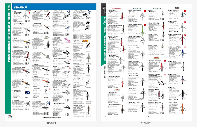
Below are a few improvements I made to the Lancaster Archery Supply's annual catalog. As mentioned previously, year one (2019-2020) was mostly spent on converting 9,000+ products to paragraph and character styles in InDesign. Year two (2020-2021) was the year I was able to implement more noticeable design changes and updates.

A newly designed introductory/contact page better organized information and made it more appealing to viewers.


Implementing colored swatches to condense the space of each product and create a cleaner look.


Reformatted some sections from 2 columns to 3 columns to optimize space due the the size of the product.


Organizing Broadheads: The simple concept of having all broadheads point the same direction, made quite the visual difference from year to year.


August 24, 2020

Lancaster Archery Supply

It has only been forever since I've posted any design or creative work. To get up to speed-in November of 2018 I landed a new job as a Senior Graphic Designer at Lancaster Archery Supply (LAS). My number one duty is to produce their annual Lancaster Archery Archer's Wishbook, a now 500+ page publication. I am the sole designer for this project, working directly with Purchasing and the President of the company. The bulk of my production begins around February 1st. I then send off the publication to the print vendor around the beginning of May, so the catalog hits homes by the first week of June. 

Since being at Lancaster Archery, I have produced two annual catalogs. In the first year I spent most of my time learning the previous processes, improving some of those processes that I could implement in a tight timeline and essentially make sure I got the catalog completed. Design upgrades were limited, but I made a solid list for the following year.

Some critical improvements I made in the first year was converting every single product (over 9,000) to paragraph and character styles in InDesign. I knew this would be a timely task to do while working through the general production of the catalog, but it was essential to clean up the book and get it where it needs to be organizationally. I worked over 150 hours between Feb-May outside of the normal 8-5 to get this hefty task completed, and it was a huge relief when all styles had been converted. 

The other critical improvement I implemented was the Dealer Price List. The price list for the 2019-2020 catalog consisted of over 9,200 rows and 7 columns that spanned throughout the 56 page insert. Unfortunately, this information was never properly placed in a chart within InDesign. The original process consisted of pasting this info, formatting the type, and then tabbing nearly every row to have the columns align properly. There was no way I was tabbing 9,200 rows manually, so I sought out a solution. Initially I just placed the spreadsheet information in a table and implemented table styles. However, when changes needed to be made I needed to carefully update specific rows or the entire table, which caused problems with my computer and speed. I then discovered WordsFlow, an InDesign plugin that links Excel files (and other programs), so that when the Excel spreadsheet file is updated, I can update the InDesign table in a click of a button (and of course a lot of computer updating time). The WordsFlow Pro trial allowed me to also keep the styling of the table following an update, so we now use that moving forward.

With those two (large) improvements now in place, I knew upcoming years would be much more manageable and less time consuming throughout the production months. This would open the door for some new designs and also time for me to continue to design billboards and digital and print ads for LAS.

Catalog year two (2020-2021) was as predicted much more efficiently produced. With a year under my belt, I was able to better gather print vendor estimates, prep and schedule for the upcoming year, meet with stakeholders and hit the ground running during the production months. I still had to work about 50 hours outside of my normal schedule, but felt extremely accomplished to have cut that down to 1/3 of the time. The company was very impressed with my work ethic and production, and I was rewarded by winning the very first Employee of the Quarter for Q1 of 2020. 

Catalog year three (2021-2022) production will be coming around the corner shortly, and I am already starting to prepare. My goals this year are to continue to improve processes, better prepare throughout the year to ultimately further cut down the time I have to spend outside my normal hours. One component of catalog that I do receive assistance on is the front cover design. The past two years I have been so limited on time that the Senior Creative Designer pulls together a front cover design. I hope in year three to have the time to design something, as the cover creative is what everyone sees first. The cover is the main creative spot, whereas all of the content is primarily production-based. To be able to design and produce 100% of the 500+ printed piece is certainly the ultimate goal.

At some point I'll show side by sides of the improvements from year to year more in detail. For now, below is the 2020-2021 catalog cover and spread composite.