
January 31, 2017
2017 Catalogs: XT Employee Spotlight
Like AmericanMuscle, ExtremeTerrain released new catalogs yesterday featuring new products and new content. Similar to the Customer Spotlights, there was an addition to the XT content. While the Marketing team works up a collection of good customer builds, we used an employees Jeep to make the below editorial. The design layout matches the Customer Spotlight's print piece featuring a large lifestyle at the top, products that are part of the build and additional lifestyle photos at the bottom. All of these photos were taken by our in-house photographers.
January 30, 2017
2017 Catalogs: AM Customer Spotlights
A new year means more new catalogs! The 2017 AmericanMuscle catalogs should be hitting mailboxes today featuring new content. This drop I designed the Customer Spotlights once again, this time for three different books. Below are the new Customer Spotlight editorial pieces for 2015-2017, 2010-2014 and 2005-2009 Mustangs.


January 28, 2017
AM Free Gear Campaign
AmericanMuscle ran another free gift campaign this month where the customer could choose one of eight apparel items if they spent over the set threshold ($150). The graphic designers meet up to discuss the monthly campaigns and bring inspiration to the table. I look at a lot of different sites for inspiration including Rip Curl, Backcountry, The Fasthouse, Fox Racing, Burton, Under Armour, Icon, FMF Exhaust and Roxy to name a few. Pretty much any sort of variety of motorsports, action sports or outdoors-related business are fair game to pull inspiration. With this being an apparel project, I no doubt focused a lot of Fox Racing's web banners and email graphics. I was really drawn to the image below that Fox used as a homepage banner on their site:

I really liked the split imagery, The Fasthouse uses this method a lot as well with their web banners throughout their site. With this project I was finally able to execute this look.
One of our challenges that the designers face is showing giveaway items creatively while also showing the vehicle. For example, this apparel promo would perform best, based on previous testing, with a Mustang also in the creative. With that said, in the past we've incorporated models and Mustangs in shots, and they just haven't performed as great as one would predict. I believed this Fox example would prove to be the most successful blend of showing the apparel and also showing a lifestyle of a mustang. My team agreed, as did the Marketing department, and soon enough the concept was approved.
The next step was to submit a photography request so they could order the eight apparel items for a custom shoot. I provided this example and some additional apparel examples of things I was looking for. Below are the examples I included for the shoot:


The top image is what I envisioned for the on-site graphics. The second image was what another designer brought to our monthly inspirational meeting. I planned to use an image similar to this with tools for the email creative. The goal with the email was to be more mysterious and have the customer guessing what the "free gift" could possibly be. The in-house photographer took a variety of shots based on these examples. The lifestyle portion of the web banner concept would just be pulling from our current in-house photography library on our server.
Throughout the process there were some copy adjustments, but overall the concept was really well received. Below is one of the on-site desktop graphics featuring imagery very similar to the initial concept proposed:

For email, we also ended up going with the split design and ran a copy A/B test. I used a more vague photo of the apparel including the tools. Below are the A/B versions of an email a-spot:


I was really happy with the end result of this project. It's interesting to see how similar the initial concept is with the final creative, yet has its own feel. Below are the rest of the generational lifestyles. This project included desktop and mobile site graphics as well as email a-spot and b-spots.


I really liked the split imagery, The Fasthouse uses this method a lot as well with their web banners throughout their site. With this project I was finally able to execute this look.
One of our challenges that the designers face is showing giveaway items creatively while also showing the vehicle. For example, this apparel promo would perform best, based on previous testing, with a Mustang also in the creative. With that said, in the past we've incorporated models and Mustangs in shots, and they just haven't performed as great as one would predict. I believed this Fox example would prove to be the most successful blend of showing the apparel and also showing a lifestyle of a mustang. My team agreed, as did the Marketing department, and soon enough the concept was approved.
The next step was to submit a photography request so they could order the eight apparel items for a custom shoot. I provided this example and some additional apparel examples of things I was looking for. Below are the examples I included for the shoot:
The top image is what I envisioned for the on-site graphics. The second image was what another designer brought to our monthly inspirational meeting. I planned to use an image similar to this with tools for the email creative. The goal with the email was to be more mysterious and have the customer guessing what the "free gift" could possibly be. The in-house photographer took a variety of shots based on these examples. The lifestyle portion of the web banner concept would just be pulling from our current in-house photography library on our server.
Throughout the process there were some copy adjustments, but overall the concept was really well received. Below is one of the on-site desktop graphics featuring imagery very similar to the initial concept proposed:
For email, we also ended up going with the split design and ran a copy A/B test. I used a more vague photo of the apparel including the tools. Below are the A/B versions of an email a-spot:
I was really happy with the end result of this project. It's interesting to see how similar the initial concept is with the final creative, yet has its own feel. Below are the rest of the generational lifestyles. This project included desktop and mobile site graphics as well as email a-spot and b-spots.
January 26, 2017
Tear Off Talk - Presented by Throttle Down Speed Co.
It's been one of Throttle Down Speed Co.'s missions to create more videos and generate more content. Some of our first footage taken has finally taken form and was released on the blog today under the name of "Tear Off Talk".
Define: Tear Off
A tear off is a key product that nearly every racer needs to bring with them in their gear bag to the race track. A tear off is a thin piece of plastic that is attached to a motorcycle racer's helmet visor or goggles. Based on the surface of the track and the weather conditions, the amount of tear off's added to the racer's helmet or goggles varies. The bigger the roost, the more tear off's a rider will need for each time they are out on the track. While racing a rider will reach up, pull the tear off tab across their line of vision and release the single tear off and continue on racing, restoring crystal clear vision. A tear off is essential for every dirt tracker and motocross racer.
The name Tear Off Talk originated after a brief brainstorm session between Brian and I. We tossed names back and forth several times until one caught our attention. From there I designed a logo, which also took a few versions to get it to a solid point.

I believe down the line this logo could evolve into something more, however, it does the job well and works well for video intros.
Brian got down to editing our footage of his 8 year old daughter Emma interviewing various flat track motorcycle racers. On race day, Emma came prepared with a list of questions and when it came to time for the open pits, the Throttle Down Speed Co. got behind the scenes to get Emma's questions answered. The entire process was a blast, and seeing the interviews pieced together takes on a whole new form.
Throttle Down Speed Co.'s Tear Off Talk: What Do Professional Racers Eat On Race Day has now been released. Check it out on the Throttle Down Speed Co. Blog!
Stay tuned to see the second Tear Off Talk video next week.
Define: Tear Off
A tear off is a key product that nearly every racer needs to bring with them in their gear bag to the race track. A tear off is a thin piece of plastic that is attached to a motorcycle racer's helmet visor or goggles. Based on the surface of the track and the weather conditions, the amount of tear off's added to the racer's helmet or goggles varies. The bigger the roost, the more tear off's a rider will need for each time they are out on the track. While racing a rider will reach up, pull the tear off tab across their line of vision and release the single tear off and continue on racing, restoring crystal clear vision. A tear off is essential for every dirt tracker and motocross racer.
The name Tear Off Talk originated after a brief brainstorm session between Brian and I. We tossed names back and forth several times until one caught our attention. From there I designed a logo, which also took a few versions to get it to a solid point.
I believe down the line this logo could evolve into something more, however, it does the job well and works well for video intros.
Brian got down to editing our footage of his 8 year old daughter Emma interviewing various flat track motorcycle racers. On race day, Emma came prepared with a list of questions and when it came to time for the open pits, the Throttle Down Speed Co. got behind the scenes to get Emma's questions answered. The entire process was a blast, and seeing the interviews pieced together takes on a whole new form.
Throttle Down Speed Co.'s Tear Off Talk: What Do Professional Racers Eat On Race Day has now been released. Check it out on the Throttle Down Speed Co. Blog!
Stay tuned to see the second Tear Off Talk video next week.
January 23, 2017


January 18, 2017
Women Who Ride
I've had this vision in my head of a sticker design to represent women riders. The original photograph came from mrsjjfive's collection, a photo of flat tracker Morgan Monroe. With Morgan joining the Throttle Down Speed Co. team, the image would fit perfectly to not only represent her, but also women riders in general.
The other evening I attempted to sketch the vision that I've carried for a few weeks, maybe even a couple months now. I took pencil to Rives BFK, took a photo of the sketch, tossed it in Illustrator and vectorize it. The graphite on the textured paper just didn't translate when I did a quick Illustrator image trace, and I was quite unsatisfied with the image. Tonight I took a second attempt-this time micron on Rives. I did most of it in a 02 micron, added detail with a 005 and then filled in the larger areas with a thick Sharpie. Already I was liking the overall image.
From there I tossed the image into Photoshop, added a Black & White filter as well as a Curves layer to make the black and white very prominent and to minimize the middle gray tones. I saved that out and tossed it into Illustrator to do a quick image trace. Since it was hand drawn the line work from the image trace was naturally imperfect. While I like the hand drawn look, I wanted to smooth out some of the line work to make the overall image more clear. Smoothing out the lines would also benefit future vinyl cuts.
To complete the image I added a black background and a thick white stroke around the entire graphic to make the woman rider really pop. Below is the transition from ink on paper to the final vector art. Stay tuned to see future applications and potential sticker and vinyl prints!
January 16, 2017
Building Vinyl
Last month I was tasked with a rather fun and typically more rare project to work on. Turn5 was looking to transform a room that would be part of a building solely for video purposes. The primary focus would be employees recording installing parts within the company vehicles. The room I got tasked to transform would be treated as a break room and also as a large meeting room.
To kick off this project, I went to see the space, take measurements, take a ton of photos and talk to a few key people on specifications and what they would like to see in the space. From there I was brainstorming all sorts of ideas and that whole process was really exciting. There were a few design challenges involved, including the fact that no walls would be painted and that they would remain as is. Currently this room is painted a yellow shade. Also before getting started, I met with the vinyl department to see how any graphics would be implemented and discussed file size options. Once the specs were laid out, I could get to creating.

While I personally do not have a lot of experience with video, it still very much is a creative language, so I wanted to do something that would appeal to the creatives. My other mission was to include automotive and tool imagery since the installers are naturally gear heads. By mashing those two concepts as well as some subtle Turn5 branding I came up with an idea for 4 large panels. These panels would start at the very top of the wall and stretch vertically to the bottom. They would be spaced around the room on two of the walls within the break room. My overall concept was large black and white automotive-related images with video-related vector elements in the Turn5 orange.
I made two of the panel images desaturated stock photos of tools. The other two I used in-house lifestyle photography of installing parts on our company vehicles: one Mustang and one Wrangler. I also desaturated those images and balanced the black & white filters to make all four panels feel like they were cut from the same cloth. I then began to pull vector stock graphics that ranged from sound waves, gauges, timeline elements, rulers and a variety of video and camera-related imagery.

From there, I got creative with the placement of the vector images on top of the photos. While these panels would have space in between them, one suggestion was to make them look like they were one. For example, if I placed a sound wave element running off the right side of panel one, on panel two it would come in on the left side in a similar placement. This really tied all of the panels together quite nicely. I played with the opacity of the different vector elements until I got something that felt nicely balanced throughout. The final touch to the entire imagery was to add a warm filter over the black and white images so that they would look more natural on the pre-painted yellow walls. Without the warm photo filter applied, the colors competed on the wall color, whereas the filter made it feel much more natural.

Once I had the files created in Illustrator, I sent them to our in-house vinyl department for that team to work their magic. A few adjustments needed to be made to incorporate safe zones and the like. We ran into a few printing complications with the size and had to adjust. Soon enough they were installed within the room by the vinyl team.


To kick off this project, I went to see the space, take measurements, take a ton of photos and talk to a few key people on specifications and what they would like to see in the space. From there I was brainstorming all sorts of ideas and that whole process was really exciting. There were a few design challenges involved, including the fact that no walls would be painted and that they would remain as is. Currently this room is painted a yellow shade. Also before getting started, I met with the vinyl department to see how any graphics would be implemented and discussed file size options. Once the specs were laid out, I could get to creating.
I made two of the panel images desaturated stock photos of tools. The other two I used in-house lifestyle photography of installing parts on our company vehicles: one Mustang and one Wrangler. I also desaturated those images and balanced the black & white filters to make all four panels feel like they were cut from the same cloth. I then began to pull vector stock graphics that ranged from sound waves, gauges, timeline elements, rulers and a variety of video and camera-related imagery.
From there, I got creative with the placement of the vector images on top of the photos. While these panels would have space in between them, one suggestion was to make them look like they were one. For example, if I placed a sound wave element running off the right side of panel one, on panel two it would come in on the left side in a similar placement. This really tied all of the panels together quite nicely. I played with the opacity of the different vector elements until I got something that felt nicely balanced throughout. The final touch to the entire imagery was to add a warm filter over the black and white images so that they would look more natural on the pre-painted yellow walls. Without the warm photo filter applied, the colors competed on the wall color, whereas the filter made it feel much more natural.
January 14, 2017
Ice Racing Trophy Plates
Ice racing has always been a fascination of mine, and going to a race has been on my bucket list for a few years now. Friday I finally got to cross it off the list as I attended Round 1 of the 41st World Championship ICE Racing event in Reading, PA. Lucky for me, I got to play a bigger role than just a spectator that night.

About a month ago I got in contact with the McGrane family to help with the design of the trophy plates. Fallen flat tracker Kyle McGrane called this race track home, and his brother Tommy wanted to make these plates extra special for this round. I was more than happy to help, and I got into Illustrator to put Tommy's vision to life. The whole process went really smooth, and the final printed product turned out really rad. Below are the 1st, 2nd and 3rd place plates for the bikes main event.
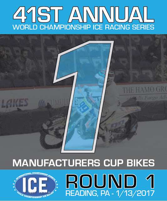


All three plates are very similar in their design, but the placement of the transparent picture of Kyle in the background is unique on each. I designed the 1st place plate first and made sure the 99A was large and centered. When I began to work with the 2nd and 3rd plates, the shape of those numbers were significantly different, so the placement of the 99A had to shift. I made the image a bit smaller so that when I placed it, you could see the 99A number plate clearly on each plate, while it still being fairly centered. In my opinion, this also made the 1st place plate stand out a bit more. I also did a second version of the plates for the quad class that just swapped out some copy. Tommy was really happy with the designs and printed them.
On race day I ran an Aid to Injured Riders booth at the arena and had a great set up right inside the doors. AIR had stickers for Kyle, Charlotte, Morgan and Dominic for sale, Kyle bracelets and our flat track trading card sets.

I ended up having some really good conversations with the fans. Some knew flat trackers, others didn't. Even those who didn't know much about flat track, still donated money, and it was yet another humbling experience. Below is an action shot of the AIR set up with Throttle Down Speed Co.'s Em front and center!

At the end of the night I got my very own copies of the number 1 plates that Logan McGrane got signed for me! I've already found a sweet spot for them in my apartment to show them off. Congratulations to Jake Mataya for making a last lap pass for the lead to put the #99A bike on top of the box.

About a month ago I got in contact with the McGrane family to help with the design of the trophy plates. Fallen flat tracker Kyle McGrane called this race track home, and his brother Tommy wanted to make these plates extra special for this round. I was more than happy to help, and I got into Illustrator to put Tommy's vision to life. The whole process went really smooth, and the final printed product turned out really rad. Below are the 1st, 2nd and 3rd place plates for the bikes main event.
All three plates are very similar in their design, but the placement of the transparent picture of Kyle in the background is unique on each. I designed the 1st place plate first and made sure the 99A was large and centered. When I began to work with the 2nd and 3rd plates, the shape of those numbers were significantly different, so the placement of the 99A had to shift. I made the image a bit smaller so that when I placed it, you could see the 99A number plate clearly on each plate, while it still being fairly centered. In my opinion, this also made the 1st place plate stand out a bit more. I also did a second version of the plates for the quad class that just swapped out some copy. Tommy was really happy with the designs and printed them.
On race day I ran an Aid to Injured Riders booth at the arena and had a great set up right inside the doors. AIR had stickers for Kyle, Charlotte, Morgan and Dominic for sale, Kyle bracelets and our flat track trading card sets.
I ended up having some really good conversations with the fans. Some knew flat trackers, others didn't. Even those who didn't know much about flat track, still donated money, and it was yet another humbling experience. Below is an action shot of the AIR set up with Throttle Down Speed Co.'s Em front and center!
At the end of the night I got my very own copies of the number 1 plates that Logan McGrane got signed for me! I've already found a sweet spot for them in my apartment to show them off. Congratulations to Jake Mataya for making a last lap pass for the lead to put the #99A bike on top of the box.
January 12, 2017
Raxiom Site Updates
Part of my on-going duties is to maintain and update house brand websites. The Raxiom brand continues to expand as more products are created for various vehicles including Mustang, F-150 and Wrangler. As new products are added, I like to continue to add them to the Featured Products section of Raxiom.com. This month I added ten new products to the top of the featured section and worked with the web development team to execute the additions.


Updates for this section are pretty simple, as I pull the assets, arrange them in the grid and slice them up. I also provide the sort category (vehicle type), product name and the type of Raxiom product (ie: Performance Lighting) that appears on hover. The sort function is what I think is the highlight of this grid of products, as you can see different parts for different vehicles and the boxes rearrange accordingly. This site is responsive and so is that functionality. Check it out here: Raxiom.com/featured.
Updates for this section are pretty simple, as I pull the assets, arrange them in the grid and slice them up. I also provide the sort category (vehicle type), product name and the type of Raxiom product (ie: Performance Lighting) that appears on hover. The sort function is what I think is the highlight of this grid of products, as you can see different parts for different vehicles and the boxes rearrange accordingly. This site is responsive and so is that functionality. Check it out here: Raxiom.com/featured.
January 11, 2017

January 10, 2017
Who Is Throttle Down Speed Co? - BMAT
The racing off season is a drag, let's face it. In an attempt to keep it interesting the TDSC co-founders (Brian & myself) filled out interviews for everyone to get to know us a little better. Check out Brian's here, and stay tuned for mine tomorrow!

January 09, 2017
Bromley: New Year, New Number, New Logo
Last season Throttle Down Speed Co. rider Dan Bromley qualified and raced in several GNC1 national flat track races. In 2017 he is rewarded with a new national number for this year and he chose the historic #62. It will be really cool to see him rocking the new digits and to go along with that will be a new logo for his shirts. Above are two versions and the logo needed to be slightly tweaked to accommodate for our vinyl cutting process. TDSC looks forward to 2017, and supporting the Throttle Down Team. Not too much longer until Daytona...
January 05, 2017
CB Rear Fender


My CB360 rear fender was next on the restoration list. The exterior wasn't too rusty, however, underneath was pretty ugly looking. Per usual I resorted to steel wool, Mothers Polish and some quality elbow grease to remove the rust. The end goal was to paint it black to match the springs I recently done (see previous progress post.)


The exterior cleaned up beautifully and quickly, where the underside took a lot more elbow grease. I had then painted it black with some "rattle can", as my Caro friends like to refer to it as, and it was looking really good. I removed the tape I used to protect the rubber and screw holes and quickly nicked part of the paint off. I figured I'd touch it up and use some clear coat. I had 1shot enamel laying around and figured that wouldn't hurt to use as touch up paint. Tonight I got some clear coat to top it all off.
To my surprise a reaction occurred either between the clear and the enamel or purely the cold temperatures. It's days like these I wish I paid more attention in science class.


The bubbles spread in various areas and removed all of the paint when wiped with a towel. Looks like I will be stripping it down, digging out my steel wool again to smooth it out. Then I'll repaint it and clear it in appropriate temperatures, sans enamel. Looks like I'll keep on learning! Stay tuned...
January 04, 2017
AM January Sale
Every now and then a designer will do a project that they're happy with, but for various reasons it may be replaced with something else. That's the case with this AmericanMuscle January Sale creative I made last month. I went in with a concept of a rolling car in an cold winter scene. Below is the inspirational image I found in a Google search.

With the concept approved, I searched through various stock backgrounds to get a similar feel. When I found the image below I flipped the orientation, removed some distracting elements, adjusted the color and warmth of the photo and then added motion blur.


The above wasn't the final back plate I used, but it was enough to get started on the renders. I first rendered the 2015 Mustang and made it a dark gray to keep the overall icy feel that was in the inspirational image. I did some compositing with the render to get everything to fit in the scene. From there I added the 2015 image into the various on site and email templates. What I found was most of the winter background ended up getting cropped out due to the orientation of the templates. Below is an on site web banner.

I do feel the image is more impactful with more mountains and sky showing, however, the wintry feel was still very much there in the crop. I proceeded with the other car generations and composites to complete the full package. For graphics that needed copy, I kept it simple. Below are some generational web banners with the simplistic copy.


I was happy with the final graphics for this project. Unfortunately it needed to be replaced with alternative creative, but sometimes that's how it goes in the design world. On to the next!
With the concept approved, I searched through various stock backgrounds to get a similar feel. When I found the image below I flipped the orientation, removed some distracting elements, adjusted the color and warmth of the photo and then added motion blur.
The above wasn't the final back plate I used, but it was enough to get started on the renders. I first rendered the 2015 Mustang and made it a dark gray to keep the overall icy feel that was in the inspirational image. I did some compositing with the render to get everything to fit in the scene. From there I added the 2015 image into the various on site and email templates. What I found was most of the winter background ended up getting cropped out due to the orientation of the templates. Below is an on site web banner.
I do feel the image is more impactful with more mountains and sky showing, however, the wintry feel was still very much there in the crop. I proceeded with the other car generations and composites to complete the full package. For graphics that needed copy, I kept it simple. Below are some generational web banners with the simplistic copy.
Subscribe to:
Posts (Atom)