September 24, 2020

2020 Lancaster Archery Classic Patch

Last January, Lancaster Archery hosted the 2020 Lancaster Archery Classic at Spooky Nook Sports Complex. The event was a huge success again, but like any event, it took a lot of time and effort. Each year we design a new event t-shirt and hat. I had come up with a design that worked very well for a patch hat and sticker. Below is the black and white of the final version.

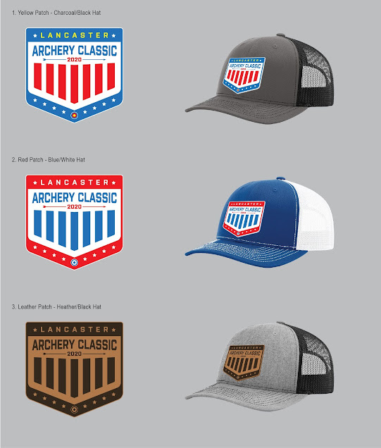
To finalize the design, we went through a few color variations. Overall I wanted to focus on red, white and blue. 2020 was to be an Olympic year, so I wanted something that felt patriotic and somewhat represented the USA. Not to mention, the red, white and blue color scheme lines up well with the archery target colors and the LAS logo. Below were the final three designs I had proposed.

The second design was preferred, but the small target on the bottom was changed to the blue, red and yellow rings to stay true to the targets used at the Classic event. 


As of now there are still some hats available at https://www.lancasterarchery.com/2020-lancaster-archery-classic-hat.html 

September 22, 2020

CompetitionArcheryMedia.com

Competition Archery Media (CAM) is a brand created to broadcast live archery events. Last year I created a Squarespace site for CAM and it has since grown to what it is now. There is still room for additional growth, and Squarespace is an easy platform to handle those changes.

One of the main tasks was to highlight the sponsors, with the focus of course being on the platinum sponsors. Therefore, they are featured towards the top of the homepage and also on the Sponsors page. 

Another important component was the event schedule. Once the 2019 schedule was completed, the page seemed very outdated. To make it more interactive, I went and added images and video playlists of the past events, so if visitors came to this page they had more interesting content. 

An advertising page became very important when wanting to gather sponsors for the 2020 archery season. This page was added along with updated sponsor packets I designed. These downloadable PDFs include the same website branding and colors. They also include images and examples of what each sponsorship level receives. The analytics PDF is a recap of the 2019 season, again using the same design elements to keep the brand professional and consistent. Below is a grid of the 2019 analytics summary.

The Squarespace template offers a seamlessly responsive website to be easily viewed on desktop, mobile and tablet. View the current website here: https://www.competitionarcherymedia.com

September 04, 2020

LAS Apparel: Align Hoodie

I can't say this enough... I LOVE apparel design! 

Each year LAS likes to launch some new t-shirt, hoodie and hat designs. Last year I worked on a hoodie design that I wanted to be modern, have a focus on typography and have some American design elements included. 2020 was meant to hold the Olympics, so I thought including an American theme would be appealing to our American archers.

I started with a large blank canvas in Adobe Illustrator. Utilizing different sans serif typefaces, I began brainstorming by typing out Lancaster Archery Supply and other taglines, phrases and related information. I incorporated the target, stars and the American flag in these sketches. Overall I was breaking away from the Lancaster Archery logo, while still designing with the brand in mind.

I landed on the below mock that was eventually approved by the appropriate stakeholders. This design loudly states "Lancaster Archery Supply" with an intentional focus on "Archery." "Established in 1983" is much smaller but knocked out of a white block background to provide balance in the overall design. Underneath features a flag with the company location, while intentionally emphasizing "USA."


Then came the time to source a hoodie. While using a local screen printer, I confirmed I wanted a royal blue hoodie to stay consistent with the LAS colors. At the time, LAS didn't have a bold blue garment for sale like this one, so it added variety to the apparel line. By having a bold garment, I was able to successfully use a one-color design to reduce cost overall.

After getting several hoodie samples from our screen printer, we decided to go with the Independent Trading Co. SS4500 Mens Midweight Hooded Pullover Sweatshirt in Royal Blue.


Once the hoodies were ordered and received in inventory, our in-house photographer used an in-house employee as the hoodie model. Our eCommerce team added the image and description to the site, and I included the new product in the 2019-2020 LAS catalog.


This hoodie is available for purchase on the Lancaster Archery website: https://www.lancasterarchery.com/lancaster-archery-supply-align-hoodie.html. It is definitely a design I am very proud of and pleased with the final design!

September 03, 2020

Galaxy Bow International Ad

Galaxy archery is a house brand of Lancaster Archery Supply. We primarily advertise the Galaxy brand overseas in the UK publications. For years, LAS and Galaxy have been a loyal advertiser in Bow International magazine. When I joined LAS, we had been using an ad for several issues in a row that overall was quite dark. When I saw the printed ad, I didn't love how the blacks weren't as dark as intended. Therefore, I decided to lighten the design up overall. 

The primary focus is to advertise the Galaxy Solstice riser. I wanted to provide more description and text in this ad than had been used before. I wanted to keep the previous feel of the Galaxy brand with the lifestyle, but also pull out the product more. Overall I am really happy with how the ad turned out and how the printed publication looked.


September 02, 2020

LAS Now Hiring Billboards

LAS wanted to run some Now Hiring billboards in neighboring towns. I browsed billboard inventory on three different vendors' sites. We ended up reserving digital billboard space in York, Douglassville, Sanatoga, Reading and Limerick.

My goal was to create something simple and eye-catching. The primary jobs available require archery knowledge and experience, so I wanted the target to be very apparent. 

Since digital boards have way more flexibility than static posters, we decided to run a series of creative. I created two with lifestyle images and one with just text. The designs would rotate per cycle.


Most of the billboards were the wide ratio above, however, there were a few that were smaller overall and a thinner width. For those, we went with strictly a text layout.


I personally felt accomplished when I received a text from a friend and former co-worker from my previous employer who happened to see the board. He even admitted to not typically looking or reading billboards. Guess this one just caught his eye... success!