Showing posts with label Adobe. Show all posts

June 25, 2021

Lancaster Archery Camo Apparel

 Last year I had designed some camo apparel for Lancaster Archery. Many companies apply a camo pattern as a fill to their logo and I thought it'd be perfect for Lancaster Archery. I also wanted to incorporate the American flag on the sleeve. Not only does the flag appeal to those who have served our country, but with 2020 being an Olympic year, I wanted to incorporate some USA pride.

I designed a t-shirt and hoodie simultaneously. I went with a black hoodie and a brown shirt. To keep the cost down on an already 4-color design, I made sure the same camo coloring would look good on both colored garments. Below are the design mocks I sent over to the screen printer.


I worked with the printer to select the right Pantone colors that would work for both garments. Once we got the samples in, our in-house photographers were able to take photos for our website.


Archer Chris Bee was rocking one of the t-shirts at the Lancaster Archery Customer Appreciation Event this month:


Get yours at Lancaster Archery! T-shirt | Hoodie

March 01, 2017

Time Lapse Rose Drawing


First and foremost, GoPro's are awesome. I've been meaning to capture the progress of my drawings and paintings and finally purchased a GoPro to do so. I used the time lapse feature and began to mess with the speed settings. While this one is a little more choppy than I was initially going for, it certainly does the job. This drawing took about 30 minutes, and I did speed it up in post at 200%. The drawing is graphite pencil on Rives BFK.


February 28, 2017

Project Management: Brand Logos

Delegation has been the name of the game for my new Senior Designer role, and I really got a taste of it leading a project to develop a few brand logos. I was tasked to manage a project where we would design up to five new logos for new brands for various products. These logos would need to be developed by the end of Q1. Each week the design team would meet, present logo designs and critique them. Revisions were made and eventually we finalized designs. Once we landed on one, I made a few minor tweaks to clean up the files, got the proper approvals and got the files ready for our internal style guide. Four out of the five logo designs originated from other designers on my team.


The fifth logo took an additional round of designing as the initial direction wasn't entirely clear. Because of that though, the process was revised a bit to include the client earlier in the design process so that a logo wasn't finalized and not used for subjective reasoning. SpeedForm was the logo that took the most work to finalize, and overall it did turn into a solid design. Another designer had made the initial logo, but when it came time to redesign it I took a stab at it. Below is the finalized design after a few rounds of critique.


These logos will now be implemented onsite and within our various print catalogs. Most of these brands span across both of the ecommerce stores: AmericanMuscle.com and ExtremeTerrain.com.

January 18, 2017

Women Who Ride

I've had this vision in my head of a sticker design to represent women riders. The original photograph came from mrsjjfive's collection, a photo of flat tracker Morgan Monroe. With Morgan joining the Throttle Down Speed Co. team, the image would fit perfectly to not only represent her, but also women riders in general. 

The other evening I attempted to sketch the vision that I've carried for a few weeks, maybe even a couple months now. I took pencil to Rives BFK, took a photo of the sketch, tossed it in Illustrator and vectorize it. The graphite on the textured paper just didn't translate when I did a quick Illustrator image trace, and I was quite unsatisfied with the image. Tonight I took a second attempt-this time micron on Rives. I did most of it in a 02 micron, added detail with a 005 and then filled in the larger areas with a thick Sharpie. Already I was liking the overall image.

From there I tossed the image into Photoshop, added a Black & White filter as well as a Curves layer to make the black and white very prominent and to minimize the middle gray tones. I saved that out and tossed it into Illustrator to do a quick image trace. Since it was hand drawn the line work from the image trace was naturally imperfect. While I like the hand drawn look, I wanted to smooth out some of the line work to make the overall image more clear. Smoothing out the lines would also benefit future vinyl cuts.

To complete the image I added a black background and a thick white stroke around the entire graphic to make the woman rider really pop. Below is the transition from ink on paper to the final vector art. Stay tuned to see future applications and potential sticker and vinyl prints!


January 16, 2017

Building Vinyl

Last month I was tasked with a rather fun and typically more rare project to work on. Turn5 was looking to transform a room that would be part of a building solely for video purposes. The primary focus would be employees recording installing parts within the company vehicles. The room I got tasked to transform would be treated as a break room and also as a large meeting room. 

To kick off this project, I went to see the space, take measurements, take a ton of photos and talk to a few key people on specifications and what they would like to see in the space. From there I was brainstorming all sorts of ideas and that whole process was really exciting. There were a few design challenges involved, including the fact that no walls would be painted and that they would remain as is. Currently this room is painted a yellow shade. Also before getting started, I met with the vinyl department to see how any graphics would be implemented and discussed file size options. Once the specs were laid out, I could get to creating.


While I personally do not have a lot of experience with video, it still very much is a creative language, so I wanted to do something that would appeal to the creatives. My other mission was to include automotive and tool imagery since the installers are naturally gear heads. By mashing those two concepts as well as some subtle Turn5 branding I came up with an idea for 4 large panels. These panels would start at the very top of the wall and stretch vertically to the bottom. They would be spaced around the room on two of the walls within the break room. My overall concept was large black and white automotive-related images with video-related vector elements in the Turn5 orange.

I made two of the panel images desaturated stock photos of tools. The other two I used in-house lifestyle photography of installing parts on our company vehicles: one Mustang and one Wrangler. I also desaturated those images and balanced the black & white filters to make all four panels feel like they were cut from the same cloth. I then began to pull vector stock graphics that ranged from sound waves, gauges, timeline elements, rulers and a variety of video and camera-related imagery. 


From there, I got creative with the placement of the vector images on top of the photos. While these panels would have space in between them, one suggestion was to make them look like they were one. For example, if I placed a sound wave element running off the right side of panel one, on panel two it would come in on the left side in a similar placement. This really tied all of the panels together quite nicely. I played with the opacity of the different vector elements until I got something that felt nicely balanced throughout. The final touch to the entire imagery was to add a warm filter over the black and white images so that they would look more natural on the pre-painted yellow walls. Without the warm photo filter applied, the colors competed on the wall color, whereas the filter made it feel much more natural. 


Once I had the files created in Illustrator, I sent them to our in-house vinyl department for that team to work their magic. A few adjustments needed to be made to incorporate safe zones and the like. We ran into a few printing complications with the size and had to adjust. Soon enough they were installed within the room by the vinyl team.


January 09, 2017

Bromley: New Year, New Number, New Logo


Last season Throttle Down Speed Co. rider Dan Bromley qualified and raced in several GNC1 national flat track races. In 2017 he is rewarded with a new national number for this year and he chose the historic #62. It will be really cool to see him rocking the new digits and to go along with that will be a new logo for his shirts. Above are two versions and the logo needed to be slightly tweaked to accommodate for our vinyl cutting process. TDSC looks forward to 2017, and supporting the Throttle Down Team. Not too much longer until Daytona...

November 29, 2016

AM Free Calendar Promotion

Previously I had posted about the AM Calendar designs I had retouched (see post). To follow the successfully printed calendar, a promotional campaign was put together by the Marketing department that I got to execute. We ran a similar campaign last year so a lot of the design direction and elements were pulled from that successful creative. By using the lifestyle photography from within the printed calendar, the campaign was more easily put together and the focus was on typography and layout. Below is an example of an email aspot and bspot that ran during this calendar campaign.


There were additional social and on-site graphics that used similar layouts to the above. This campaign has since ended and a new similar campaign has begun using a similar concept. The messaging has changed slightly and where applicable, I chose a different image for each car generation. Below is another email a-spot and an on-site banner.


November 16, 2016

2017 AmericanMuscle Calendar

Each year AmericanMuscle comes out with a brand new calendar for the upcoming year. The images are a combination of shots taken by our in-house photographers and purchased photographs from other sources. The photos are retouched by the creative department and the graphic design department designs the template and creates the final printed product. This year's front cover was a Photoshop composite by one of the designers, and I retouched, manipulated and designed the back cover image. Below are the three months where I retouched the photos and made the stylized numbers we came up with for the 2017 Calendar. Also included below is the back cover to feature MMD products that involved color changing the car, manipulating the lines on the ground, adding the MMD logo, adding red stripes to the ground and using various camera raw filters within Photoshop. 


Additional creative was needed for the campaign to promote the calendar, of which I used the photographs within the calendar to support the promotion. Graphics spanned across the email, social and on-site channels, of which I will share in a future post.

November 15, 2016

Promotional Apparel Designs

AmericanMuscle and ExtremeTerrain are by no means an apparel company, however, over the holidays the two stores typically need a few t-shirt and hoodie designs for promotions and campaigns. Throughout the year I try to design and gather apparel designs so when promotions arise, we have things to choose from rather than rushing to create them. Below are the three designs I worked on for this years holiday promotional apparel. The designs include one ExtremeTerrain t-shirt, one ExtremeTerrain hoodie and one AmericanMuscle hoodie. The two ExtremeTerrain items have been used in the promotion I previously posted. 


The Voyager t-shirt above features a one-color vector design on the front that plays off of the idea of navigation and the compass. Nature and automotive design elements are included in this design to embrace the lifestyle of the ExtremeTerrain customer. On the back is the ExtremeTerrain logo. These dark navy graphics are screen printed on a sand colored poly-cotton t-shirt. You can purchase this hoodie here at ExtremeTerrain.com.


The Altitude hoodie above features a one-color vector design on the front. It features the XT logo and elements from the ExtremeTerrain logo to blend the two marks together. On the sleeve is a smaller XT logo that can be seen while driving and exploring the trails. The two white graphics are screen printed on a quality dark gray hoodie. You can purchase this hoodie here at ExtremeTerrain.com.


The Turbulence hoodie above features a two-color vector design on the front. It breaks apart the traditional AmericanMuscle logo and added hash marks and design elements have been added to complete the design. "American" has been knocked out so the blue from the hoodie comes through similarly to how the original logo is colored. On the sleeve is a similar one-color hash mark design featuring the AM logo that can be seen easily while driving. These vector graphics are screen printed on a quality deep royal hoodie.


I worked closely with the Merchandising team to source the garments and select the correct apparel colors and Pantones. All of these studio photos were taken by our in-house photographers. As always, I am looking forward to completing more apparel designs for these two stores and working with other designers to get their ideas printed as well.

November 14, 2016

ExtremeTerrain Holiday Promotion

This year ExtremeTerrain.com is running a holiday promotion when customers purchase gift certificates. When a customer spends a certain amount he/she receives a t-shirt, and if more is spent one gets a hoodie. These garments have been designed and printed specifically for this promotion and have become new products on the site.

In addition to designing these two apparel items, I wanted to create unique imagery for the promotion. I sourced several examples that inspired the final creative. My primary inspiration came from the motorcycle industry, are you surprised? I truly appreciate the photography from Fox Racing and The Fast House, and pushed in the direction of the following photos from The Fast House site.


What attracted me to most of these was the shallow depth of field which brought a solid focus to the product. I also really enjoyed the lights in the background that would give my creative the holiday touch it needed. I was primarily drawn to the first image with the yellow shirt in the foreground. I thought the person in the background could represent the Jeep I needed to show in the ExtremeTerrain creative. Because this campaign was promoting two apparel items, I referenced the web banner with the two jerseys side by side. With that said, I began to work with one of our in-house photographers to make the vision come to life. Below is the shots we settled on for the JK and TJ Wrangler.


This photography was then applied to the various display, email, social and site graphics requested by the various Marketing channels. Below is an example of a forum banner graphic with the copy provided by the Marketing team.


The promotion is currently running on the XT Holiday Gift Garage. I'll post more photos to show the apparel designs more in detail-stay tuned.

September 13, 2016

Colleen's Bridal Shower

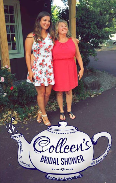
One of my favorite ladies is getting married October 15th and I have the honor to stand up there with her as one of her bridesmaids. This past Sunday we held Colleen's Bridal Shower at the Lederach Tea Room. As one of my small gifts I wanted to design a Snapchat Geofilter for the event. Per usual, it all started as a sketch. I wanted to make it delicate and feminine and fit the tea room theme. I included the date of the shower and "The Future Mrs. McCabe". Below is the sketch (please forgive the poor photo quality), the vector art, and the final filter put to the test! What a huge success for such a small design.


September 12, 2016

Yourn Nonce

Again, it has been a while since my last post, but I promise it is not due to a lack of design work! In fact, my workload has been a bit crazier and seems to get crazier as the holiday season approaches. Last month I had the privilege to do a logo design for a friend's vintage brand: Yourn Nonce. The brand has seen great growth since it started, and I am a big fan! With events approaching, Yourn Nonce needed a logo and some solid branding. 

My friend and I used Pinterest to collect ideas so I had a starting point for what she was looking for. She collected various script letterform ideas and borders she liked. With that I pulled out my pens and paper and got to drawing. When a designer gets a job that they really believe in, they dive right in and it makes it even more enjoyable. This was that project for me. My normal routine is surrounded by the automotive world and generally has a sturdy, masculine undertone. This was quite the opposite, and it is so nice to have those breaks now and then. I had a lot of creative liberty and got to work. Below is the result of micron to paper.


I drew each letter individually, knowing that the spacing wouldn't be perfect in the drawing. I wanted to make sure I had room for all of the added elements as they came to life. From there I brought the letters into Illustrator and did a quick image trace. Overall it translated quite well and needed a few touchups. I proposed the idea and my client happily approved! There's always some question in whether the client will be onboard with your idea and final product, as I had with this one. At the same time, I enjoyed drawing the letters so much that I had confidence she would also like them. If she ended up not liking them, I still had fun in the meantime! Luckily I was good to go and clean up was all that was needed for this part. Below is the final "YN" logo vectorized and polished.


Once I had that completed and approved, I wanted to use those letterforms with the current brand font to create the full Yourn Nonce Logo.


In addition to those two designs, I also wanted to design a more simplistic version of the letterforms for additional applications. While keeping the overall style, a more simplistic version could be needed for other forms such as a rubber stamp, vinyl, etc. Below are two additional versions of the YN, based on the original drawing.


I also made the two simplified versions with the full Yourn Nonce lettering. A final request to include a border with the YN logo was made and I referenced the Pinterest board of inspiration. Below is the final with the border.


Again, I am very happy with how this package turned out, as was my client, so it was a complete success. Additionally I made white PNG versions and will work on adding a pop of color to the brand. In the meantime, please check out the branding and the Yourn Nonce Vintage store here: Facebook |  Store

Finally, below is an animated gif of the letterform progression just for fun!