Showing posts with label drawing. Show all posts

July 03, 2021

Bri's Business Cards

 I'm still catching up with some different projects I've done over the past few years. This one goes all the way back to August of 2019. A friend, Bri, asked if I could design a business card for her as she began her career as an esthetician. She came with some inspiration and then I took it to pencil and paper.

The concept revolved around half of an elephant face, wildflowers and color. Below shows my initial sketch of a full elephant and then half of it traced with micron pen and wildflowers sprinkled in the background.


From there I scanned the drawing into Adobe Illustrator and did an image trace of half of the elephant to transform it into a vector file. I always do a bit of cleaning up to make the line work more smooth. An image trace at the right threshold can do a decent job, but it always looks better tidied up.


At this point, I took the vector image above into Adobe Photoshop. I wanted to add some splashes of color, almost in a bohemian style. I used various brushes, transparencies, splatters, etc. to get the final image.


To finish up this project for Bri, I mocked this image on a couple different business card concepts so she can see some different color, typeface and patterned concepts.


This was definitely a project I was excited about and it was easy to get inspired to create the final product. Cheers to successful friends!

January 12, 2021

Florasaurus 2021

Each January Native Poppy, a flower shop in San Diego, runs a dinosaur and flower drawing contest they refer to as their Annual Florasaurus Competition. While I don't usually partake in many contests anymore, this one is definitely one I still very much enjoy.

This year's contest is accepting entries through Jan. 17. Native Poppy will select 4 finalists and voting will be from Jan. 20 to Jan. 24. Winners to be announced Jan. 27.

Below is my entered drawing, wish me luck!


Feel free to check out their Instagram at https://www.instagram.com/native_poppy

August 26, 2020

LAS Apparel: Women's Wild One Tee

I LOVE apparel design! One of my favorite shirts I have designed for LAS was this Women's Wild One Tee. Like most of my best apparel designs, this one began as a hand drawn sketch.

The goal was to create something feminine for the female archer/hunter. I spent a lot of time finding the right shirt sample-something feminine, flattering for many body types, and also a decent fit since so many women's shirts run small. For the sketch, I went in a floral/bohemian approach.


From there I brought the sketch into Illustrator and converted it to a vector file. It took a decent amount of touch ups and tweaks since the sketch was generally small and rough. I experimented with different colors and potential garments, before ultimately landing on the Anvil Women's Freedom Tee in rose with a white and black design. I added in the "Lancaster Archery Supply" text subtly below the right antler to add some LAS branding without taking away from the overall design feel.

The grey pictured above represents the knocked out pieces. Therefore, this could be screen printed with only black and white ink. The grey above will just be the rose garment color. Using the t-shirt colors is one of my favorite techniques. Not only does it create complexity to the design, but it also allows me to implement an additional color without adding an ink color which then adds cost.

Once we got this design produced, it became available to purchase on the Lancaster Archery website. Our in-house photographer took great photos of the shirt. You can currently purchase this shirt here: https://www.lancasterarchery.com/lancaster-archery-supply-womens-wild-one-tee.html


March 30, 2017

Crown Drawing

March has generally been a busier month with some traveling and a heavier workload. This past week I've managed to take on a side project to get a pencil back in my hand. It's easy for me to get caught up in the digital world and designing on the computer, so I really value breaks that involve paper and pencil. 

A friend came to me asking for a drawing project of two crowns. I was tasked with recreating each crown and adding some design elements to them. Initially both were to get a swirl design added, however, there was a need to make one of the crowns more masculine. I began by sketching out each crown on a 5"x7" piece of Rives BFK. From there I used microns to perfect the outlines. I cleaned up the sketch marks I initially had and then went in to do shading and detailing with various graphite pencils. With that looking well I added the extra design elements. To the queen crown I kept the swirls per request. The king crown provided a bit of a design challenge, but I ended up sketching several options where the client chose one he liked the best. I completed that with the same micron then graphite process to get the final drawings. Below is an animated gif of the progress made with the queen drawing.


Throughout the process I filmed the progress of each drawing with my GoPro Hero 5 Session. I've been experimenting with the time lapse settings and believe I have found the sweet spot. Stay tuned for a future post of time lapse footage. Below are the drawings along with some detail shots. 


March 01, 2017

Time Lapse Rose Drawing


First and foremost, GoPro's are awesome. I've been meaning to capture the progress of my drawings and paintings and finally purchased a GoPro to do so. I used the time lapse feature and began to mess with the speed settings. While this one is a little more choppy than I was initially going for, it certainly does the job. This drawing took about 30 minutes, and I did speed it up in post at 200%. The drawing is graphite pencil on Rives BFK.


February 13, 2017

When In Doubt...

These words have been dancing around in my head for a while now, and I finally got them properly down on paper. When in doubt, be rad.


It began with a 4H graphite pencil sketch followed by a 005 micron outline. The 01 micron gave more definition to the letterforms with the help of a ruler to straighten some of them out. From there I roamed freely with a 005 blue micron to fill in the RAD.


January 18, 2017

Women Who Ride

I've had this vision in my head of a sticker design to represent women riders. The original photograph came from mrsjjfive's collection, a photo of flat tracker Morgan Monroe. With Morgan joining the Throttle Down Speed Co. team, the image would fit perfectly to not only represent her, but also women riders in general. 

The other evening I attempted to sketch the vision that I've carried for a few weeks, maybe even a couple months now. I took pencil to Rives BFK, took a photo of the sketch, tossed it in Illustrator and vectorize it. The graphite on the textured paper just didn't translate when I did a quick Illustrator image trace, and I was quite unsatisfied with the image. Tonight I took a second attempt-this time micron on Rives. I did most of it in a 02 micron, added detail with a 005 and then filled in the larger areas with a thick Sharpie. Already I was liking the overall image.

From there I tossed the image into Photoshop, added a Black & White filter as well as a Curves layer to make the black and white very prominent and to minimize the middle gray tones. I saved that out and tossed it into Illustrator to do a quick image trace. Since it was hand drawn the line work from the image trace was naturally imperfect. While I like the hand drawn look, I wanted to smooth out some of the line work to make the overall image more clear. Smoothing out the lines would also benefit future vinyl cuts.

To complete the image I added a black background and a thick white stroke around the entire graphic to make the woman rider really pop. Below is the transition from ink on paper to the final vector art. Stay tuned to see future applications and potential sticker and vinyl prints!


November 28, 2016

Throttle Down Speed Co. Cafe Racer Socks


In lieu of Cyber Monday, we launched another new product on ThrottleDownSpeedCo.com today! Now available: Cafe Racer Socks that feature a sketch I had drawn quite a while ago and a Throttle Down Speed Co. logo on the reverse side. Initially we ordered a sample of the socks to test the quality of the print. To our surprise it printed better than ever and no detail was lost. Therefore, we added it to our inventory and are now sharing it with all of the other gear heads. Get yours here.


November 11, 2016

Charlotte Kainz 2006-2016

A post about Charlotte Kainz is surely overdue. I officially met Charlotte earlier this year on March 10th in Daytona Beach, Florida. Throttle Down Speed Co. had added her to the newly three-racer team and I was officially meeting her in person. Throughout the season I got to know her more each race, making sure to stop by at her pit at each one. Charlotte even joined the Aid to Injured Riders fundraiser in Oklahoma City. 

On Sunday, September 25, 2016, Charlotte Kainz lost her life racing in her heat in a nasty crash at the Santa Rosa Mile. It will probably be impossible to forget those minutes from the very first text where I asked what the hold up was in the timing, hearing that Charlotte was involved in the crash, receiving phone calls in the moment and simply waiting for the next update stunned and hopeful. My hope was quickly released, she was gone. 

Time has passed for a month and a half and I still have some very sad moments. One of the most satisfying conversations I had was with Nicalee where she suggested that maybe I channel my emotions into a memorial sticker design for Charlotte. We could sell them easily through the Aid to Injured Riders and send the funds to Charlotte's dad. I was already sketching some things, I had an idea instantly, and then news broke that another rider was in very serious condition from a separate race at the very same track: Kyle McGrane. 

A 20 year old girl from Milwaukee, Wisconsin and a 17 year old guy from Gap, Pennsylvania both lost their lives in the season finale AMA Pro Flat Track motorcycle race. My flat track family was broken. Nothing made sense. Everyone was hurting. Somehow we managed to lean on each other's broken shoulders and pull together for various fundraisers and memorial services the following month. 

Brent Riley of Access Media Labs designed a beautiful sticker for Kyle and he had helped AIR by printing and donating the stickers for Charlotte that I had designed. Sunday, October 16th the Piston Poppers Raceway held their last race of the season that included a memorial service for Kyle and Charlotte. It was one of the most beautiful things I have experienced. All of the riders lined up with their bikes in the center of the track as Kyle's closest friends and family made a few memorial laps around the track. After a few laps 99 red and blue balloons were released in honor of Kyle and 35 pink and white balloons were released in honor of Charlotte. Even just typing this brings back vivid memories and a wave of shivers. As beautiful as the whole ceremony was, I have to say I was hit the hardest the very first moment I got to the track. I walked up to see who was out there and it was the little ones on their PW50s. One of the kids was sporting a memorial shirt with photos of Kyle and Charlotte, and seeing that broke my heart. The support that day was moving, and I was so grateful to be able to spend the day with my racing family.


I cannot explain how overwhelming the support has been within the motorcycle community. So many people are kind and so many have made generous donations to each of these families and to AIR to support everyone. The entire process is humbling and I am forever grateful to have grown into this racing family and to have met the racers, pit crews, families, friends, fans, everyone. Not only do I get to be apart of such a wonderful group of people, I also get to make art for the sport I've loved my entire life. It doesn't get any better than this, I will tell you that.

Below is my design I had made for Charlotte. I hope you all have at least one of these stickers by now, but if you do not, be sure to send a message to AIR on Facebook. Each sticker is a $3 donation and all of the money goes to Charlotte's family. It's the same deal for Kyle's stickers as well. I hope you represent these stickers with nothing but pride. 


Above is the initial sketch. The 35L was made in Illustrator and printed. I sketched both sides of the wing in pencil and used microns to complete the right side. I only did one side in pen, planning to vectorize that and mirror it on the other side.


Above are the final designs. The one with her name was the one that got printed and sold by AIR. I'm so happy with how it came out, and I hope everyone else is too. RIP 35L & 99A.

"You will always be remembered, you will be celebrated. You will never be forgotten, these tears still haven't faded" - Flatliners - Eulogy 

November 09, 2016

Separate Songs

I have quite a love for the band Restorations, and one of my absolute favorite songs by them is Separate Songs. This band is one I can listen to any day of the week, when I am in just about any mood. That's more than I can say about many other bands and music groups. Separate Songs has some of the most well-written lyrics in my opinion. From "You said you worry about me leaving, I fear I'm already gone" to the chorus of "all singing the same time to separate songs" and going into the killer bridge...

Anyways, listen to it. Listen to all of LP3. While you're at it, listen to everything you can and then go see them in person and be wowed. 


The other night I played around with hand lettering ideas and came up with this. The next time you see it, it'll be on my gray 3/4 Bell helmet. Stay tuned, the 1shot is drying.


October 18, 2016

McCabe Drawings

I particularly enjoy making drawings for friends and family getting married, and I have posted a lot of these in the past. Most of the time I draw or get creative with letterforms, typically the beginning of the couple's last name. My friends Colleen and Paul got married on October 15th, and I needed a unique idea. The couple already have several "M" decorations for their married name of McCabe, so I abandoned the letterform idea. I was fortunate to be a bridesmaid in their wedding and was elated, and because of this I got a lot of details on how Colleen was planning her wedding, including the flowers in the bouquets. Recently I have been drawing some flowers with micron pens primarily, and the idea struck to do a series of drawings of flowers that would be in Colleen's bouquet. The three flowers I decided to choose to draw were a sunflower, a white rose and a white ranuculus. All were done with very thin micron pens at 8"x8". I added some boulder details with a thicker pen. I debated adding some color with chalk pastels but ended up being so pleased with the black and white prints that I kept them as is. They were double matted in white with a dark brown frame that reflected some gold when looked at in a certain light. Below are the final drawings and a photo of my bouquet from the wedding. Colleen and Paul had a gorgeous wedding, had a full on dance party at the reception and I am so happy to have been apart of the celebration. Congratulations to the McCabes!


September 15, 2016

The Houck H

I'll wrap up this delicate wedding theme with one final wedding gift I had created this month. Below is an ornamental, hand drawn "H" I have made for my friends-Ryan and Rachel who just got married this past Saturday. I wanted to create something unique and refined. I decided to go with a thinner font and the letterform developed as I took pen to paper. The final was 8"x8" matted and framed in a 12"x12" double matted frame. Below is the evolution of the "H".


Congratulations Mr. & Mrs. Houck!

September 13, 2016

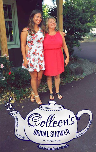
Colleen's Bridal Shower

One of my favorite ladies is getting married October 15th and I have the honor to stand up there with her as one of her bridesmaids. This past Sunday we held Colleen's Bridal Shower at the Lederach Tea Room. As one of my small gifts I wanted to design a Snapchat Geofilter for the event. Per usual, it all started as a sketch. I wanted to make it delicate and feminine and fit the tea room theme. I included the date of the shower and "The Future Mrs. McCabe". Below is the sketch (please forgive the poor photo quality), the vector art, and the final filter put to the test! What a huge success for such a small design.


September 12, 2016

Yourn Nonce

Again, it has been a while since my last post, but I promise it is not due to a lack of design work! In fact, my workload has been a bit crazier and seems to get crazier as the holiday season approaches. Last month I had the privilege to do a logo design for a friend's vintage brand: Yourn Nonce. The brand has seen great growth since it started, and I am a big fan! With events approaching, Yourn Nonce needed a logo and some solid branding. 

My friend and I used Pinterest to collect ideas so I had a starting point for what she was looking for. She collected various script letterform ideas and borders she liked. With that I pulled out my pens and paper and got to drawing. When a designer gets a job that they really believe in, they dive right in and it makes it even more enjoyable. This was that project for me. My normal routine is surrounded by the automotive world and generally has a sturdy, masculine undertone. This was quite the opposite, and it is so nice to have those breaks now and then. I had a lot of creative liberty and got to work. Below is the result of micron to paper.


I drew each letter individually, knowing that the spacing wouldn't be perfect in the drawing. I wanted to make sure I had room for all of the added elements as they came to life. From there I brought the letters into Illustrator and did a quick image trace. Overall it translated quite well and needed a few touchups. I proposed the idea and my client happily approved! There's always some question in whether the client will be onboard with your idea and final product, as I had with this one. At the same time, I enjoyed drawing the letters so much that I had confidence she would also like them. If she ended up not liking them, I still had fun in the meantime! Luckily I was good to go and clean up was all that was needed for this part. Below is the final "YN" logo vectorized and polished.


Once I had that completed and approved, I wanted to use those letterforms with the current brand font to create the full Yourn Nonce Logo.


In addition to those two designs, I also wanted to design a more simplistic version of the letterforms for additional applications. While keeping the overall style, a more simplistic version could be needed for other forms such as a rubber stamp, vinyl, etc. Below are two additional versions of the YN, based on the original drawing.


I also made the two simplified versions with the full Yourn Nonce lettering. A final request to include a border with the YN logo was made and I referenced the Pinterest board of inspiration. Below is the final with the border.


Again, I am very happy with how this package turned out, as was my client, so it was a complete success. Additionally I made white PNG versions and will work on adding a pop of color to the brand. In the meantime, please check out the branding and the Yourn Nonce Vintage store here: Facebook |  Store

Finally, below is an animated gif of the letterform progression just for fun!


August 06, 2016

Aid to Injured Riders (AIR)'s Charlotte Snapchat Filter

Last weekend was the AMA Pro Flat Track Grand National Championship race in Charlotte, NC. The race was held at the Dirt Track in Charlotte and was a really great event from start to finish. I personally love that area, it's booming, a well-kept city and is centered around racing. This year Nicalee of Aid to Injured Riders (AIR) came to me with an idea for the non-profit. Since it was such a success in OKC, she proposed designing another Snapchat filter for this racing event. Charlotte has a bit of history within the flat track community and is home to one of the greats, the late Will Davis. Not only was Winkin' Will Davis extremely well-known within the flat track community, he was by far my favorite racer to watch growing up as a kid going to races with my dad. His life was taken at a race in 2001 at Sedalia, MO, and the flat track family took a huge loss that day. The following year Davis' number plate and boot print were added to the grounds at the Charlotte Dirt Track and his legacy lives on. With all of that, Nicalee's goal was to have the Snapchat filter link to Will Davis in some form.

That direction was simple enough, it was finding time to come up with something great that was more of a challenge. One evening I took a pen to paper and sketched and image of Will Davis racing from a quick online photo search. From there I tossed it into Illustrator and then Photoshop using the Adobe Shape. I cleaned up the line work and got the image below:


From there I added the AIR logo in the "dust" and added a subtle gradient in the background of the filter so that the image would be more visible on a variety of different backgrounds, colors and times of the day. Below is the email from Snapchat after I submitted it and it was approved.


The filter was live during race day from 2pm-11pm while all of the action was happening. I used it several times and according to the statistics, it got a solid amount of usage that evening. It is surely a design I'm proud of, and it's always great to add something to the flat track community that I've grown up loving. The only thing I would do differently would be to include a larger location fence where the Snapchat filter could be used because I underestimated the size and dimensions of the racing pits, so most areas of the pits were out of reach for the filter. It did however cover the stands so fans could enjoy it. Below is one of several shots that I had taken with the filter, I personally think it looks pretty rad!