Showing posts with label logo. Show all posts

July 03, 2021

Bri's Business Cards

 I'm still catching up with some different projects I've done over the past few years. This one goes all the way back to August of 2019. A friend, Bri, asked if I could design a business card for her as she began her career as an esthetician. She came with some inspiration and then I took it to pencil and paper.

The concept revolved around half of an elephant face, wildflowers and color. Below shows my initial sketch of a full elephant and then half of it traced with micron pen and wildflowers sprinkled in the background.


From there I scanned the drawing into Adobe Illustrator and did an image trace of half of the elephant to transform it into a vector file. I always do a bit of cleaning up to make the line work more smooth. An image trace at the right threshold can do a decent job, but it always looks better tidied up.


At this point, I took the vector image above into Adobe Photoshop. I wanted to add some splashes of color, almost in a bohemian style. I used various brushes, transparencies, splatters, etc. to get the final image.


To finish up this project for Bri, I mocked this image on a couple different business card concepts so she can see some different color, typeface and patterned concepts.


This was definitely a project I was excited about and it was easy to get inspired to create the final product. Cheers to successful friends!

July 02, 2021

Lancaster Archery Foundation

The Lancaster Archery Foundation launched late spring 2021. Designs and concepts have been in the work for quite some time before that. Design-wise it all started with the logo. I wanted to create something that was clean, modern and simplistic while tying it to the Lancaster Archery brand. I experimented with typeface weights, stacking and the orientation. Below is the final logo.


From there I began to design a website via Squarespace. I started with a Squarespace template and designed several page mocks in Photoshop. From there I created an outline of copy needs for the Foundation team to complete the content of the site. 


I began sourcing images for the different pages. For images we needed, such as the board of director photos, I found examples to give to our in-house photographer. Eventually when all images and content were compiled, we were able to pull everything together for the website.


At launch, the website consisted of eight different pages utilizing various template components including a contact form and donation page. Our in-house videographer created a video for the Foundation launch and I designed a YouTube thumbnail for that video.


Overall this project took a great deal of coordination to get various departments communicating, making decisions and gathering assets for the launch. In the end it came together quite well. 

Check out the current website here: LancasterArcheryFoundation.org

June 04, 2021

Story Crane

Last year I had done a freelance logo project for a friend for the brand Story Crane: a video production brand. Before I received the project, other logo design attempts were made, but weren't exactly what the client was looking for. So by the time I got the project, the client had many notes and sketches to better showcase his brand. The fact that the client put so much thought into the concept of the Story Crane brand, really made this an appealing freelance project. Not only did he provide a thorough description of how he came up with the name, but he also sent a Pinterest board with logos and graphics he liked, but also explained what he liked about the graphics. He had some loose sketches, and the one really resonated and got the wheels turning. Here is a glimpse of the Pinterest board with inspiration
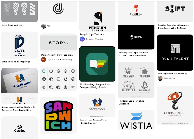

I took to pencil and paper initially to sketch out a concept that incorporated a book (for story) and the letters S & C. I started stacking the S and C in a very simplistic and geometric way. I went into Illustrator to see if the sketched concept would make sense in vector form. And sure enough, I could see it coming together as I had initially envisioned. 

Below is the initial mark I created for Story Crane. I worked initially in grayscale to separate the interwoven letterforms. I also made it one color to see if it would still translate. Then I experimented with how to use two different shades to create different looks. Overall this design incorporated the pages of the book, opened and stacked, the S and C letter forms, and then also the structure of a building to reference construction cranes.


The bottom left seemed to translate the best to me, to separate the S and the C letterforms. However, the one on the right really spoke to me as a skyscraper structure. The coloration represented shadows on the building, giving the mark a lot of dimension.

From this point I threw around some other ideas in Illustrator, but every now and then you hit the nail on the head on the first attempt. I don't believe the other sketches came anywhere close, but I still sent them off to the client to see what he thought. Fortunately, him and I were on the same page.

From there I cleaned up the lines, experimented with subtle rounded corners and created some color options. For the color I wanted to stick with a monochromatic design to continue with the building shadows concept. I had also added a simple, clean typeface and stacked Story Crane underneath the mark. I had sent over the below options.

The client liked all of the versions and could see using each one in different applications. So quite honestly, this was an insanely painless freelance project! I really enjoyed being able to create something that was so well-received, following the client being initially disappointed in the designs he had received from others in the past.

Check out Story Crane: www.storycrane.com


May 18, 2021

Lila3lla Logo

My friend (Bmat of Throttle Down Speed Co.) has shared his love of video games and love of geckos with his daughter Lily. They're currently building her brand's identity: Lila3lla. He asked if I could design a logo for her. He reached out to someone on fiver a while back to come up with a proof of concept for her video game logo. He wanted something girly, but also bad ass that would tie in her love of gaming and geckos. Simple enough, right?

I thought on it for a while and finally got into Illustrator. I wanted to include how she wears her hair, how she smiles and capture part of her youth. I definitely didn't want to make her look too young in hopes of her being able to use the logo design for a few years. I went with purples to be girly yet bad ass. Through a Google search, I had found this inspiring photo of a girl holding a snake. She looked confident and powerful, which is what inspired the posture of Lila3lla's logo. Then I had to learn a bit about geckos to illustrate them accurately.

Below is the final product! She posts gecko stories regularly on her Instagram. I can't wait to see what her and her sister become as they continue to grow up.


May 14, 2021

Right on Cue

One of my new favorite hobbies lately has been playing pool in league. I joined the American Poolplayer Association (APA) the end of 2019 due to the encouragement of my best friend, her husband and my boyfriend who have all been playing in league for years. Entering the APA and joining a 9-ball team, I would come in as a skill level 3 and win or lose to determine my long-term skill level. Being completely new to the sport, I quickly dropped down to a skill level 1 with a ton to learn. This allowed a lot of flexibility for the team though since we had a broad range of skill levels already on the team. 

I lost a TON at first, but that definitely made that first win extremely memorable. Eventually COVID-19 put a wrench in any social activities including pool league. One benefit we had was a pool table in the basement. I watched a bunch of intro videos and practiced nearly every weekend. When we came back to shooting league later in 2020, I was winning and bumped up to a skill level 2. Our team went through some changes as well and were now under a new name Right on Cue.

Once back to shooting full time in league, Right on Cue placed first during the "summer 2020" session. Unfortunately, we lost the first round of playoffs, however, since we had finished first in the session we advanced to regionals. Being a team full of friends outside of league, we were all really excited at our ticket to regionals. The winner of regionals then advances to go play in Las Vegas. While we have a couple months until our shot in regionals, we all decided we needed a logo design and t-shirts. After my busy catalog season at work, I got inspired and designed a logo.

In true fashion, I designed a logo based around a great typeface. Additionally, I came up with the concept of having the name be large and keep the pool concept subtle but still recognizable to those in league. "Right on Cue" references hitting the cue ball with right English, causing the cue ball to move differently after contact with the object ball than it would if you hit it straight on. Many instructor videos include diagrams of applying English with a red dot to signify where the tip of your cue should make contact with the cue ball. I wanted to include that concept subtly within the logo.

Initially I was thinking of using the "o" in "on" to represent the red dot. However, after several attempts, I couldn't quite get it to work or find the right font to pull off the concept. From there I focused on the dot of the "i" in "Right". Below is what I came up with.


Hopefully we can get these made up in time for regionals and have a successful weekend shooting! Until then, we'll be practicing weekly and having fun while doing it.

November 21, 2017

AmericanMuscle Holiday Gift Garage

It's been a while, to say the least. Most of the summer was consumed of designing for the AmericanMuscle Mustang Show, traveling here and there and moving to a new spot. I'd like to pick back up where I am currently, and then hopefully backtrack to share some of the show graphics.

Every year the holiday promotions seem to get bigger and more involved. This year, the company has introduced zmags, an outlet for the graphic designers to create custom landing pages without having to utilize our busy e-commerce developers. I worked on the AmericanMuscle Holiday Gift Garage campaign that included a zmags landing page, on-site graphics, email graphics, display adwords, social graphics and catalog covers and inserts.

I started with a really awesome in-house photo of our 2015 Mustang in the snow. I made a few adjustments in Camera Raw to boost the image quickly.


I wanted the overall campaign to have an icy winter feel to it, so I began by color changing the car to Grabber Blue and building out the background for the catalog cover. The build out is a bit rough, but worked with the layout I had.


I also needed to cut out the car for the web graphics I intended to use. Additionally, I wanted to render out the other car generations from Keyshot, so I removed the car from the scene in Photoshop so the other cars would lay over top. I kept the original wheels and shadow to get the placement of the new cars in their accurately. Below is the back plate I used for the renders.


I added cars into Keyshot and added additional aftermarket parts to them that were built in-house. Below is the 2014 Mustang with added mods that was placed in the scene, color changed and with an HDRI map applied and edited to look closely to the original 2015. 


I repeated this process for the other four Mustang generation cars. While those were rendering, I focused on the layout of the custom zmags landing page. 

I started off with a rough concept for both desktop and mobile. I wanted to combine lifestyle imagery and product imagery throughout the layout while working with the categories selected by the Marketing Department. Without having all of the finalized product sku's and images, I came up with the below version for desktop.

Through a few rounds of revisions, it landed closely to the above design and was then made generationally. I used the rendered cars at the top of this and then a mix of in-house lifestyle photography and product photography. I incorporated sliders into a few categories as well as off-car product photography to give the layout dimension and variety. Throughout the entire layout, I placed a vector geometric pattern that symbolized wrapping paper. Overall the goal was to have a winter feel with holiday hints carried throughout. Below is a closeup of a section with the "wrapping paper" pattern darkened to more easily see the design.


Note: the above image was pulled from Fox Racing and was the design inspiration and direction for the Holiday Gift Certificate Promotion I'll show later. I also incorporated these vector elements in the campaigns logo I was working on simultaneously.

"Holiday Gift Garage - The Perfect Presents" was the marketing copy for this entire package. Similarly to last year, I designed a logo to be used throughout the campaign to be included in web graphics and on the catalog covers. I used the above vector pattern within the logo I designed and created a version to be used on white and on black.


I also needed a version with slightly different copy to be used in display ads and Facebook social graphics.

Before sending all of the above into the proofing system, I did a quick mock of the AmericanMuscle catalog cover for the 2015-2017 generation. The layout of the copy was later revised, but the overall imagery and concept was approved.


Once the above was approved, I made some tweaks per request and began making the additional site, email, display and social graphics while building out the zmags landing page. I did the full package for the '15-'17 generation first before duplicating and creating the others. Below is the final 2010-2014 generation homepage hero.


When the customer clicks on Shop Gifts, they are taken to the zmags landing page. Below is the 2015-2017 landing page I had designed and built via the Creator.


While the campaign is still live on AmericanMuscle.com, you can view and interact with the landing page here. The final catalog cover design for that same generation is below. As you can see I incorporated the vector elements on the front and back cover as I had throughout the landing page.


The catalogs arrived in customers' mailboxes this month and also featured an insert that included products within the Holiday Gift Garage. Below is the 4-page insert design. 


Many other graphics were built to promote this campaign on the various channels. Below includes email graphics and display ads.


February 28, 2017

Project Management: Brand Logos

Delegation has been the name of the game for my new Senior Designer role, and I really got a taste of it leading a project to develop a few brand logos. I was tasked to manage a project where we would design up to five new logos for new brands for various products. These logos would need to be developed by the end of Q1. Each week the design team would meet, present logo designs and critique them. Revisions were made and eventually we finalized designs. Once we landed on one, I made a few minor tweaks to clean up the files, got the proper approvals and got the files ready for our internal style guide. Four out of the five logo designs originated from other designers on my team.


The fifth logo took an additional round of designing as the initial direction wasn't entirely clear. Because of that though, the process was revised a bit to include the client earlier in the design process so that a logo wasn't finalized and not used for subjective reasoning. SpeedForm was the logo that took the most work to finalize, and overall it did turn into a solid design. Another designer had made the initial logo, but when it came time to redesign it I took a stab at it. Below is the finalized design after a few rounds of critique.


These logos will now be implemented onsite and within our various print catalogs. Most of these brands span across both of the ecommerce stores: AmericanMuscle.com and ExtremeTerrain.com.

January 26, 2017

Tear Off Talk - Presented by Throttle Down Speed Co.

It's been one of Throttle Down Speed Co.'s missions to create more videos and generate more content. Some of our first footage taken has finally taken form and was released on the blog today under the name of "Tear Off Talk".

Define: Tear Off
A tear off is a key product that nearly every racer needs to bring with them in their gear bag to the race track. A tear off is a thin piece of plastic that is attached to a motorcycle racer's helmet visor or goggles. Based on the surface of the track and the weather conditions, the amount of tear off's added to the racer's helmet or goggles varies. The bigger the roost, the more tear off's a rider will need for each time they are out on the track. While racing a rider will reach up, pull the tear off tab across their line of vision and release the single tear off and continue on racing, restoring crystal clear vision. A tear off is essential for every dirt tracker and motocross racer.

The name Tear Off Talk originated after a brief brainstorm session between Brian and I. We tossed names back and forth several times until one caught our attention. From there I designed a logo, which also took a few versions to get it to a solid point.


I believe down the line this logo could evolve into something more, however, it does the job well and works well for video intros. 

Brian got down to editing our footage of his 8 year old daughter Emma interviewing various flat track motorcycle racers. On race day, Emma came prepared with a list of questions and when it came to time for the open pits, the Throttle Down Speed Co. got behind the scenes to get Emma's questions answered. The entire process was a blast, and seeing the interviews pieced together takes on a whole new form. 

Throttle Down Speed Co.'s Tear Off Talk: What Do Professional Racers Eat On Race Day has now been released. Check it out on the Throttle Down Speed Co. Blog!

Stay tuned to see the second Tear Off Talk video next week.

January 09, 2017

Bromley: New Year, New Number, New Logo


Last season Throttle Down Speed Co. rider Dan Bromley qualified and raced in several GNC1 national flat track races. In 2017 he is rewarded with a new national number for this year and he chose the historic #62. It will be really cool to see him rocking the new digits and to go along with that will be a new logo for his shirts. Above are two versions and the logo needed to be slightly tweaked to accommodate for our vinyl cutting process. TDSC looks forward to 2017, and supporting the Throttle Down Team. Not too much longer until Daytona...

November 15, 2016

Promotional Apparel Designs

AmericanMuscle and ExtremeTerrain are by no means an apparel company, however, over the holidays the two stores typically need a few t-shirt and hoodie designs for promotions and campaigns. Throughout the year I try to design and gather apparel designs so when promotions arise, we have things to choose from rather than rushing to create them. Below are the three designs I worked on for this years holiday promotional apparel. The designs include one ExtremeTerrain t-shirt, one ExtremeTerrain hoodie and one AmericanMuscle hoodie. The two ExtremeTerrain items have been used in the promotion I previously posted. 


The Voyager t-shirt above features a one-color vector design on the front that plays off of the idea of navigation and the compass. Nature and automotive design elements are included in this design to embrace the lifestyle of the ExtremeTerrain customer. On the back is the ExtremeTerrain logo. These dark navy graphics are screen printed on a sand colored poly-cotton t-shirt. You can purchase this hoodie here at ExtremeTerrain.com.


The Altitude hoodie above features a one-color vector design on the front. It features the XT logo and elements from the ExtremeTerrain logo to blend the two marks together. On the sleeve is a smaller XT logo that can be seen while driving and exploring the trails. The two white graphics are screen printed on a quality dark gray hoodie. You can purchase this hoodie here at ExtremeTerrain.com.


The Turbulence hoodie above features a two-color vector design on the front. It breaks apart the traditional AmericanMuscle logo and added hash marks and design elements have been added to complete the design. "American" has been knocked out so the blue from the hoodie comes through similarly to how the original logo is colored. On the sleeve is a similar one-color hash mark design featuring the AM logo that can be seen easily while driving. These vector graphics are screen printed on a quality deep royal hoodie.


I worked closely with the Merchandising team to source the garments and select the correct apparel colors and Pantones. All of these studio photos were taken by our in-house photographers. As always, I am looking forward to completing more apparel designs for these two stores and working with other designers to get their ideas printed as well.

October 10, 2016

AmericanMuscle Car Cover

AmericanMuscle.com runs various campaigns throughout the year with promotions that include free gifts. The Marketing team brainstorms creative ways to execute these promotions with new gift ideas and marketing strategies. Most recently, the idea of an AmericanMuscle branded car cover was executed. I worked with the Email Marketing team and Product Development to work on an affordable design to be printed on a car cover. Below is the design I had created in vector format.


Once the design was approved the Product Development team got a sample in and we had the in-house photography department shoot various studio shots of the car cover on the Mustangs. The logo was printed on each side of the car cover. Below are the two angles of the car used with the messaging. The first is a blog banner. The second would be the banner you'd see if you click the blog banner and go to the landing page on AmericanMuscle.com. 


Overall this project was a lot of fun and yet another opportunity to design something for a new product.