Showing posts with label video. Show all posts

June 04, 2021

Story Crane

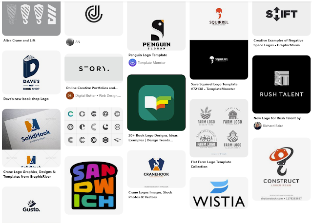
Last year I had done a freelance logo project for a friend for the brand Story Crane: a video production brand. Before I received the project, other logo design attempts were made, but weren't exactly what the client was looking for. So by the time I got the project, the client had many notes and sketches to better showcase his brand. The fact that the client put so much thought into the concept of the Story Crane brand, really made this an appealing freelance project. Not only did he provide a thorough description of how he came up with the name, but he also sent a Pinterest board with logos and graphics he liked, but also explained what he liked about the graphics. He had some loose sketches, and the one really resonated and got the wheels turning. Here is a glimpse of the Pinterest board with inspiration

I took to pencil and paper initially to sketch out a concept that incorporated a book (for story) and the letters S & C. I started stacking the S and C in a very simplistic and geometric way. I went into Illustrator to see if the sketched concept would make sense in vector form. And sure enough, I could see it coming together as I had initially envisioned. 

Below is the initial mark I created for Story Crane. I worked initially in grayscale to separate the interwoven letterforms. I also made it one color to see if it would still translate. Then I experimented with how to use two different shades to create different looks. Overall this design incorporated the pages of the book, opened and stacked, the S and C letter forms, and then also the structure of a building to reference construction cranes.


The bottom left seemed to translate the best to me, to separate the S and the C letterforms. However, the one on the right really spoke to me as a skyscraper structure. The coloration represented shadows on the building, giving the mark a lot of dimension.

From this point I threw around some other ideas in Illustrator, but every now and then you hit the nail on the head on the first attempt. I don't believe the other sketches came anywhere close, but I still sent them off to the client to see what he thought. Fortunately, him and I were on the same page.

From there I cleaned up the lines, experimented with subtle rounded corners and created some color options. For the color I wanted to stick with a monochromatic design to continue with the building shadows concept. I had also added a simple, clean typeface and stacked Story Crane underneath the mark. I had sent over the below options.

The client liked all of the versions and could see using each one in different applications. So quite honestly, this was an insanely painless freelance project! I really enjoyed being able to create something that was so well-received, following the client being initially disappointed in the designs he had received from others in the past.

Check out Story Crane: www.storycrane.com


March 01, 2017

Time Lapse Rose Drawing


First and foremost, GoPro's are awesome. I've been meaning to capture the progress of my drawings and paintings and finally purchased a GoPro to do so. I used the time lapse feature and began to mess with the speed settings. While this one is a little more choppy than I was initially going for, it certainly does the job. This drawing took about 30 minutes, and I did speed it up in post at 200%. The drawing is graphite pencil on Rives BFK.


February 08, 2017

6D Helmet

Below is a time lapse GoPro video of me adding a clear coat to flat track motorcycle racer Dan Bromley's 6D helmet. I am customizing his helmet for the upcoming race season with a variety of paint pens, 1shot and vinyl. Stay tuned for the final product!


February 05, 2017

TDSC Tear Off Talk: Charlotte Kainz

Last Tuesday Throttle Down Speed Co. launched the second video in the new Tear Off Talk series (view original blog post). This video features Emma of TDSC interviewing Charlotte Kainz at Rolling Wheels Raceway flat track national on August 20, 2016. Emma crafted her own fun questions and asked them to a bunch of riders that day during open pits. Not only was it Emma's first interview experience, but it was also her first motorcycle race she attended. Emma was one of Charlotte's biggest little fans, and we are grateful to have this footage and share it with everyone. 


See the video on the Throttle Down Speed Co. blog, and stay tuned for more Tear Off Talk!

January 26, 2017

Tear Off Talk - Presented by Throttle Down Speed Co.

It's been one of Throttle Down Speed Co.'s missions to create more videos and generate more content. Some of our first footage taken has finally taken form and was released on the blog today under the name of "Tear Off Talk".

Define: Tear Off
A tear off is a key product that nearly every racer needs to bring with them in their gear bag to the race track. A tear off is a thin piece of plastic that is attached to a motorcycle racer's helmet visor or goggles. Based on the surface of the track and the weather conditions, the amount of tear off's added to the racer's helmet or goggles varies. The bigger the roost, the more tear off's a rider will need for each time they are out on the track. While racing a rider will reach up, pull the tear off tab across their line of vision and release the single tear off and continue on racing, restoring crystal clear vision. A tear off is essential for every dirt tracker and motocross racer.

The name Tear Off Talk originated after a brief brainstorm session between Brian and I. We tossed names back and forth several times until one caught our attention. From there I designed a logo, which also took a few versions to get it to a solid point.


I believe down the line this logo could evolve into something more, however, it does the job well and works well for video intros. 

Brian got down to editing our footage of his 8 year old daughter Emma interviewing various flat track motorcycle racers. On race day, Emma came prepared with a list of questions and when it came to time for the open pits, the Throttle Down Speed Co. got behind the scenes to get Emma's questions answered. The entire process was a blast, and seeing the interviews pieced together takes on a whole new form. 

Throttle Down Speed Co.'s Tear Off Talk: What Do Professional Racers Eat On Race Day has now been released. Check it out on the Throttle Down Speed Co. Blog!

Stay tuned to see the second Tear Off Talk video next week.

January 16, 2017

Building Vinyl

Last month I was tasked with a rather fun and typically more rare project to work on. Turn5 was looking to transform a room that would be part of a building solely for video purposes. The primary focus would be employees recording installing parts within the company vehicles. The room I got tasked to transform would be treated as a break room and also as a large meeting room. 

To kick off this project, I went to see the space, take measurements, take a ton of photos and talk to a few key people on specifications and what they would like to see in the space. From there I was brainstorming all sorts of ideas and that whole process was really exciting. There were a few design challenges involved, including the fact that no walls would be painted and that they would remain as is. Currently this room is painted a yellow shade. Also before getting started, I met with the vinyl department to see how any graphics would be implemented and discussed file size options. Once the specs were laid out, I could get to creating.


While I personally do not have a lot of experience with video, it still very much is a creative language, so I wanted to do something that would appeal to the creatives. My other mission was to include automotive and tool imagery since the installers are naturally gear heads. By mashing those two concepts as well as some subtle Turn5 branding I came up with an idea for 4 large panels. These panels would start at the very top of the wall and stretch vertically to the bottom. They would be spaced around the room on two of the walls within the break room. My overall concept was large black and white automotive-related images with video-related vector elements in the Turn5 orange.

I made two of the panel images desaturated stock photos of tools. The other two I used in-house lifestyle photography of installing parts on our company vehicles: one Mustang and one Wrangler. I also desaturated those images and balanced the black & white filters to make all four panels feel like they were cut from the same cloth. I then began to pull vector stock graphics that ranged from sound waves, gauges, timeline elements, rulers and a variety of video and camera-related imagery. 


From there, I got creative with the placement of the vector images on top of the photos. While these panels would have space in between them, one suggestion was to make them look like they were one. For example, if I placed a sound wave element running off the right side of panel one, on panel two it would come in on the left side in a similar placement. This really tied all of the panels together quite nicely. I played with the opacity of the different vector elements until I got something that felt nicely balanced throughout. The final touch to the entire imagery was to add a warm filter over the black and white images so that they would look more natural on the pre-painted yellow walls. Without the warm photo filter applied, the colors competed on the wall color, whereas the filter made it feel much more natural. 


Once I had the files created in Illustrator, I sent them to our in-house vinyl department for that team to work their magic. A few adjustments needed to be made to incorporate safe zones and the like. We ran into a few printing complications with the size and had to adjust. Soon enough they were installed within the room by the vinyl team.