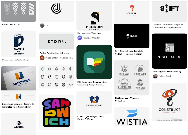
Last year I had done a freelance logo project for a friend for the brand Story Crane: a video production brand. Before I received the project, other logo design attempts were made, but weren't exactly what the client was looking for. So by the time I got the project, the client had many notes and sketches to better showcase his brand. The fact that the client put so much thought into the concept of the Story Crane brand, really made this an appealing freelance project. Not only did he provide a thorough description of how he came up with the name, but he also sent a Pinterest board with logos and graphics he liked, but also explained what he liked about the graphics. He had some loose sketches, and the one really resonated and got the wheels turning. Here is a glimpse of the Pinterest board with inspiration
I took to pencil and paper initially to sketch out a concept that incorporated a book (for story) and the letters S & C. I started stacking the S and C in a very simplistic and geometric way. I went into Illustrator to see if the sketched concept would make sense in vector form. And sure enough, I could see it coming together as I had initially envisioned.
Below is the initial mark I created for Story Crane. I worked initially in grayscale to separate the interwoven letterforms. I also made it one color to see if it would still translate. Then I experimented with how to use two different shades to create different looks. Overall this design incorporated the pages of the book, opened and stacked, the S and C letter forms, and then also the structure of a building to reference construction cranes.

The bottom left seemed to translate the best to me, to separate the S and the C letterforms. However, the one on the right really spoke to me as a skyscraper structure. The coloration represented shadows on the building, giving the mark a lot of dimension.
From this point I threw around some other ideas in Illustrator, but every now and then you hit the nail on the head on the first attempt. I don't believe the other sketches came anywhere close, but I still sent them off to the client to see what he thought. Fortunately, him and I were on the same page.
From there I cleaned up the lines, experimented with subtle rounded corners and created some color options. For the color I wanted to stick with a monochromatic design to continue with the building shadows concept. I had also added a simple, clean typeface and stacked Story Crane underneath the mark. I had sent over the below options.


