Showing posts with label design life. Show all posts

April 21, 2017

CreativeMornings in Philadelphia


This morning the Turn5 creative team met in Philadelphia at the Center / Architecture + Design for the CreativeMornings lecture. Today's speaker was Ed Tettemer who offered insight on things to believe in and how to attain love within the creative world. I was most drawn to his diagram of the color wheel and the emotions attached to each color and shade. He spoke about how when you mix emotions together, you get a larger variety, similarly as you mix colors together. 


While the lecture was interesting and covered a lot of various topics, I spent a lot of time admiring the space of this lecture as well as the city. It was really great to be in a room with a bunch of other creatives. This morning we stepped out of the corporate business world, and I felt very much like a creative. I felt inspiration from the people, the building and the city of Philadelphia. We'll see where all that takes me, but in the meantime here are a few photos trying to capture that inspiration.


January 14, 2017

Ice Racing Trophy Plates

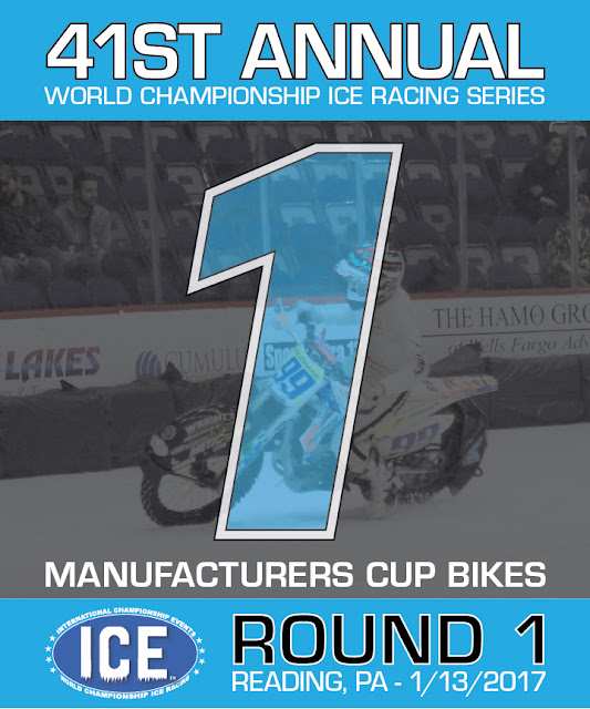
Ice racing has always been a fascination of mine, and going to a race has been on my bucket list for a few years now. Friday I finally got to cross it off the list as I attended Round 1 of the 41st World Championship ICE Racing event in Reading, PA. Lucky for me, I got to play a bigger role than just a spectator that night.


About a month ago I got in contact with the McGrane family to help with the design of the trophy plates. Fallen flat tracker Kyle McGrane called this race track home, and his brother Tommy wanted to make these plates extra special for this round. I was more than happy to help, and I got into Illustrator to put Tommy's vision to life. The whole process went really smooth, and the final printed product turned out really rad. Below are the 1st, 2nd and 3rd place plates for the bikes main event.


All three plates are very similar in their design, but the placement of the transparent picture of Kyle in the background is unique on each. I designed the 1st place plate first and made sure the 99A was large and centered. When I began to work with the 2nd and 3rd plates, the shape of those numbers were significantly different, so the placement of the 99A had to shift. I made the image a bit smaller so that when I placed it, you could see the 99A number plate clearly on each plate, while it still being fairly centered. In my opinion, this also made the 1st place plate stand out a bit more. I also did a second version of the plates for the quad class that just swapped out some copy. Tommy was really happy with the designs and printed them. 

On race day I ran an Aid to Injured Riders booth at the arena and had a great set up right inside the doors. AIR had stickers for Kyle, Charlotte, Morgan and Dominic for sale, Kyle bracelets and our flat track trading card sets. 


I ended up having some really good conversations with the fans. Some knew flat trackers, others didn't. Even those who didn't know much about flat track, still donated money, and it was yet another humbling experience. Below is an action shot of the AIR set up with Throttle Down Speed Co.'s Em front and center!


At the end of the night I got my very own copies of the number 1 plates that Logan McGrane got signed for me! I've already found a sweet spot for them in my apartment to show them off. Congratulations to Jake Mataya for making a last lap pass for the lead to put the #99A bike on top of the box.


January 09, 2017

Bromley: New Year, New Number, New Logo


Last season Throttle Down Speed Co. rider Dan Bromley qualified and raced in several GNC1 national flat track races. In 2017 he is rewarded with a new national number for this year and he chose the historic #62. It will be really cool to see him rocking the new digits and to go along with that will be a new logo for his shirts. Above are two versions and the logo needed to be slightly tweaked to accommodate for our vinyl cutting process. TDSC looks forward to 2017, and supporting the Throttle Down Team. Not too much longer until Daytona...

November 15, 2016

Promotional Apparel Designs

AmericanMuscle and ExtremeTerrain are by no means an apparel company, however, over the holidays the two stores typically need a few t-shirt and hoodie designs for promotions and campaigns. Throughout the year I try to design and gather apparel designs so when promotions arise, we have things to choose from rather than rushing to create them. Below are the three designs I worked on for this years holiday promotional apparel. The designs include one ExtremeTerrain t-shirt, one ExtremeTerrain hoodie and one AmericanMuscle hoodie. The two ExtremeTerrain items have been used in the promotion I previously posted. 


The Voyager t-shirt above features a one-color vector design on the front that plays off of the idea of navigation and the compass. Nature and automotive design elements are included in this design to embrace the lifestyle of the ExtremeTerrain customer. On the back is the ExtremeTerrain logo. These dark navy graphics are screen printed on a sand colored poly-cotton t-shirt. You can purchase this hoodie here at ExtremeTerrain.com.


The Altitude hoodie above features a one-color vector design on the front. It features the XT logo and elements from the ExtremeTerrain logo to blend the two marks together. On the sleeve is a smaller XT logo that can be seen while driving and exploring the trails. The two white graphics are screen printed on a quality dark gray hoodie. You can purchase this hoodie here at ExtremeTerrain.com.


The Turbulence hoodie above features a two-color vector design on the front. It breaks apart the traditional AmericanMuscle logo and added hash marks and design elements have been added to complete the design. "American" has been knocked out so the blue from the hoodie comes through similarly to how the original logo is colored. On the sleeve is a similar one-color hash mark design featuring the AM logo that can be seen easily while driving. These vector graphics are screen printed on a quality deep royal hoodie.


I worked closely with the Merchandising team to source the garments and select the correct apparel colors and Pantones. All of these studio photos were taken by our in-house photographers. As always, I am looking forward to completing more apparel designs for these two stores and working with other designers to get their ideas printed as well.

September 15, 2016

The Houck H

I'll wrap up this delicate wedding theme with one final wedding gift I had created this month. Below is an ornamental, hand drawn "H" I have made for my friends-Ryan and Rachel who just got married this past Saturday. I wanted to create something unique and refined. I decided to go with a thinner font and the letterform developed as I took pen to paper. The final was 8"x8" matted and framed in a 12"x12" double matted frame. Below is the evolution of the "H".


Congratulations Mr. & Mrs. Houck!

June 25, 2016

#TeamBurrito

Now and then I get to do some goofy side projects for fun. It doesn't get much goofier than a #TeamBurrito logo that a few motocross racers wanted for some hoodies.


The logo above started out as a sketch on paper. If I find the original doodle, I'll be sure to add it to the post. I scanned the sharpie sketch into Adobe Illustrator and vectorized it. I kept it one color thinking it would be for screen printed apparel. The moto guys took it to the next level-and got leather patches made for their gear. The person who made the patches added color and they turned out pretty killer.


In order to get some hoodies made, I'm going to add some color to the Illustrator file and do direct to garment printing (DTG), so we can do one-off printing and get as many colors as the guys would like. It's definitely been a fun little project that will soon hit the race tracks! Best of luck to any Team Burrito members racing this weekend at the Loretta Lynn Qualifier at Baja Acres.

May 09, 2016

AmericanMuscle Catalog: Customer Spotlight Editorials


Above are the three Customer Spotlight editorial articles that are within the insert of the 3 different versions of AmericanMuscle catalogs that arrived in mailboxes all over the US today. The first image of the yellow 2015 GT Mustang has a similar design to what I have shown in a post before. This is one of the most successful designs since it features several images in addition to a large image. I intend to design more like this in the future to show several photos of the customer car instead of just one or two like the others shown above. Customer Spotlights can be more difficult when it comes to design freedom because these rely heavily on the photo assets. These photos are all taken by their owner and submitted to our Marketing department, so the reliability of perfect assets is not guaranteed. The Marketing team does a great job at selecting the customer cars that are photographed the best, which makes my life easier. The copy is written in house and provided, along with a list of product skus to include with product images. Editorial pieces are one of my favorite pieces to design and it allows me to brainstorm and inspires me to create different layouts each time. I am currently designing the next series of Customer Spotlights for our next catalog drop, so there will be more of these designs to come!

May 03, 2016

F-150 Upgrade Shop

AmericanMuscle's F-150 product line has been rapidly growing over the past few months. Along with that comes new marketing campaigns and more graphics for the design department to create. Since the AM Mustang and ExtremeTerrain Wrangler Upgrade Shops have been proven to be a successful way for customers to shop various products, there was a need to add an F-150 Upgrade Shop. This required a similar logo design, yet one that was slightly unique from the previous two. The F-150 Upgrade Shop launched on 5/2/16 and is currently on the homepage as the main image. Below is the 2015-2016 version:


Each upgrade shop comes with a specialized landing page that includes 10 categories of products. This requires 10 unique lifestyles for each generation of F-150. We currently have products for the 2009-2014 and 2015-2016 body styles of F-150s. Below are their unique landing pages with various lifestyle images. The photos included in these are a mixture of in house photography and vendor photos.


When a customer clicks one of the categories, for example "Most Popular", the shopper is then taken to a page of products that represent that category. Each category gets a banner to match the original icon from the previous page at the top like below.

As you can imagine, each upgrade shop requires a large amount of graphics due to the variety of categories. This creative includes various on site graphics, several email graphics, social images and display creative. Overall I believe this is a nice addition to the AmericanMuscle F-150 site as it continues to grow.  View the 2015-2016 Upgrade Shop here, and view the 2009-2014 Upgrade Shop here.

Below are the original base images I had started with. The red 2015 F-150 was the original shot that I retouched in Photoshop and added a few additional aftermarket products on the truck (ie: the grille). I ended up changing the color to "Blue Jeans" to add variety to our website since most of the web graphics are typically this dark red. To create the 2011 F-150 version, I removed the 2015 from the scene in Photoshop and selected a similar angle from our various in-house photographs. I manipulated the shadow and lighting while added aftermarket parts (ie: grilles & headlights) to the 2011 as well so it fit well in the scene. Having this image with a lot of background included in the shot, allowed this image to translate well to the various sizes and dimensions of the graphics needed for this campaign. 


April 28, 2016

Turn5, Inc.


About two months ago our Art Director handed over a desktop mock of the future Turn5, Inc. site that included a total rebrand including a fresh modern logo and new color palette. From there I converted the desktop mock into a mobile mock and got to work with the development team to make the mocks come to life. After leading a few photo shoots, retouching images, rounding up numerous blocks of copy and testing the various stages of development, today was finally launch day. The brand new www.turn5.com site is responsive and showcases the professional yet casual environment my place of employment provides. While our brands our within the automotive retail industry, Turn5, Inc. provides an excellent working environment for professionals. If you are job hunting, definitely check out our career opportunities. 

This site offered a great opportunity for project management experience as I worked with the various departments to pull the entire site together. One of my favorite parts that I found most successful was working with our in-house photographer to get shots of employees working throughout our various buildings and departments. Adding those to candid shots from several events and employee testimonials in a collage within the Our Culture section is one of the most visually interesting aspects to the new site. I am also quite grateful for the video that can be viewed on desktop applications. The video team did a great job compiling footage of the various departments that make up Turn5. All together it is a great representation of the hard work and fun that goes into keeping Turn5 a thriving company. Below is a screenshot of the desktop layout, but be sure to check www.turn5.com out for yourself.


April 18, 2016

Catalog Process

Take a sneak peek into my process when tossing a catalog together:


These are technically three different catalog books but they are essentially the progression of how I handle each one individually within InDesign. Once products are selected from our Merchandising team, I make item names and charts per spread. Second I grid out the images, keeping in mind the general ratio of each product that I've come to learn over the years. Lastly, I pull the assets and pop the photos into the grid while adding lifestyle imagery and other design elements. I've found this process to be fairly efficient and visually organized. Oh the power of the grid!