June 21, 2021

LAS Bowhunter's Extravaganza

Each year the Lancaster Archery showroom hosts the Bowhunter's Extravaganza in August. It's one of the biggest sales for LAS and allows archers to get geared up for the hunting season. In Marketing, we design, print, cut, finish all of the sales signage needed for the pro shop. Additionally, we run several print advertisements in local publications. We also design and send out a mailer to LAS customers within a specific radius. 

The Extravaganza mailer is 12 page mailer printed in color, front and back that we get printed locally. We have a tall list of products to include in the mailer to get archers excited. When designing, it can be a good challenge to make all of the products fit within the 12 pages in an organized manner. Below is the design I came up with for last year's event.


June 16, 2021

Casey K's Archery Scorebook

Casey Kaufhold had an idea to create a target archery scorebook to track her arrows for indoor and outdoor shoots. I started designing based off of a printed example that had a lot of the content Casey wanted to include in her version. After a few rounds of proofing, we added some additional fields for note taking that her and her coaches thought would be relevant information to document. From there I used a local printer to get an estimate.


I wanted these booklets to be durable for Casey and other archers as they travel a lot. For outdoor events, weather and other elements occur, so I considered this as well when choosing cover paper. We also wanted to go with a wired spiral for durability and also being able to have the booklet lay flat and be compact for use and travel.

I kept the inside of the design black and white to keep the cost down for printing. On the outside, Casey wanted blue for indoor and green for outdoor. I designed a graphic-forward cover in Illustrator that included splatters, targets, arrows and a silhouette of Casey herself.


The 5" x 8.5" 48-page booklets are available on the Lancaster Archery website.

June 15, 2021

APA - American Poolplayers Association

Towards the end of 2019 I was convinced by a bunch of friends to join their pool league team on Wednesday nights. I was a total beginner, trying to learn all of the basics and fundamentals to play 9 ball. It was a bit of a rough beginning filled with a ton of nerves and matches lost. I worked myself down to a skill level (SL) 1, but through a lot of coaching and studying and practicing I managed to get my first win. We had gotten an 8 ft. Gold Crown pool table for our basement and I continued to practice and try pool drills, all while working on my stroke. I won and loss a few more times and then in 2020 covid shut down the world including league. What a time to have a pool table in your basement.

The endless "stay at home" weekends turned into pool practicing weekends, which truly turned my game around. We were having a lot of fun while I was racking up hours on the table. When league started back up for a few months, I felt like a different player at league. Before the shutdown I had a losing record with 5 wins, 10 losses. After shutdown, I had 6 wins and only 1 loss and I had moved up to a SL2. From there we had another shut down for about three months. When we restarted again I landed at the top of the MVP boards for 9 ball with a final record of 8/9 for the Fall 2020 session. Our team placed in 1st and scored a ticket to regionals.

Come the Spring 2021 session, I was convinced again to join an 8 ball team on Mondays. I came in as a SL2 and after a win my first match I got bumped up to a SL3. While still being a SL2 in 9 ball, I ended the session with a 5/8 winning record. Our 9 ball team qualified for playoffs and we get to see how that shakes out yet this week and next. While already being qualified for regionals in 9 ball, our focus was primarily on 8 ball. Playing a different game, I ended my first session with a 3/8 record but the team made it to playoffs. We had our first playoff match last night and won huge, punching our ticket to regionals with the 8 ball team now as well!

Regionals will be held the end of July, so the whole team is looking forward to those matches and trying to get as much table time as possible until then. The winner of both 8 ball and 9 ball will each get tickets to Vegas to play in the World Championships; the ultimate goal.

Below are my top patches I have earned over the past couple years. Our team had a clean sweep in 8 ball the other week. Earlier this session I got a 9 on the snap and then a Rackless match in 8 ball. My proudest match to date is a 20-0 win in 9 ball that I had this session. I look forward to collecting more patches, practicing and improving my skill and most of all shooting with our teams. It has been a way more rewarding experience than I ever could have imagined, and I can't wait to play with both of our teams at regionals in a month!


June 07, 2021

Lancaster Archery Belt Buckle

One of the more unique projects I have done at Lancaster Archery is design a branded belt buckle. I had worked with Montana Silversmiths to create a custom, archery-specific buckle design with the Lancaster Archery logo in the center. I had pulled a lot of inspiration and landed on a classic design overall with some small archery components including targets, broadheads and arrows.


Check it out on the Lancaster Archery website here.

June 04, 2021

Story Crane

Last year I had done a freelance logo project for a friend for the brand Story Crane: a video production brand. Before I received the project, other logo design attempts were made, but weren't exactly what the client was looking for. So by the time I got the project, the client had many notes and sketches to better showcase his brand. The fact that the client put so much thought into the concept of the Story Crane brand, really made this an appealing freelance project. Not only did he provide a thorough description of how he came up with the name, but he also sent a Pinterest board with logos and graphics he liked, but also explained what he liked about the graphics. He had some loose sketches, and the one really resonated and got the wheels turning. Here is a glimpse of the Pinterest board with inspiration
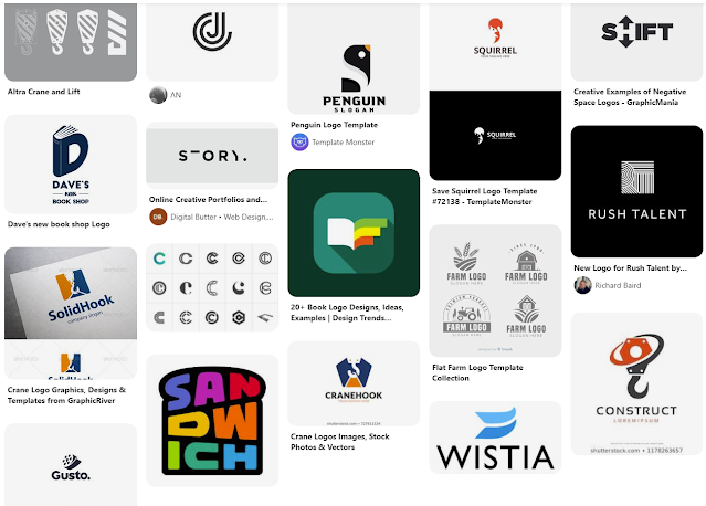

I took to pencil and paper initially to sketch out a concept that incorporated a book (for story) and the letters S & C. I started stacking the S and C in a very simplistic and geometric way. I went into Illustrator to see if the sketched concept would make sense in vector form. And sure enough, I could see it coming together as I had initially envisioned. 

Below is the initial mark I created for Story Crane. I worked initially in grayscale to separate the interwoven letterforms. I also made it one color to see if it would still translate. Then I experimented with how to use two different shades to create different looks. Overall this design incorporated the pages of the book, opened and stacked, the S and C letter forms, and then also the structure of a building to reference construction cranes.


The bottom left seemed to translate the best to me, to separate the S and the C letterforms. However, the one on the right really spoke to me as a skyscraper structure. The coloration represented shadows on the building, giving the mark a lot of dimension.

From this point I threw around some other ideas in Illustrator, but every now and then you hit the nail on the head on the first attempt. I don't believe the other sketches came anywhere close, but I still sent them off to the client to see what he thought. Fortunately, him and I were on the same page.

From there I cleaned up the lines, experimented with subtle rounded corners and created some color options. For the color I wanted to stick with a monochromatic design to continue with the building shadows concept. I had also added a simple, clean typeface and stacked Story Crane underneath the mark. I had sent over the below options.

The client liked all of the versions and could see using each one in different applications. So quite honestly, this was an insanely painless freelance project! I really enjoyed being able to create something that was so well-received, following the client being initially disappointed in the designs he had received from others in the past.

Check out Story Crane: www.storycrane.com


May 18, 2021

Lila3lla Logo

My friend (Bmat of Throttle Down Speed Co.) has shared his love of video games and love of geckos with his daughter Lily. They're currently building her brand's identity: Lila3lla. He asked if I could design a logo for her. He reached out to someone on fiver a while back to come up with a proof of concept for her video game logo. He wanted something girly, but also bad ass that would tie in her love of gaming and geckos. Simple enough, right?

I thought on it for a while and finally got into Illustrator. I wanted to include how she wears her hair, how she smiles and capture part of her youth. I definitely didn't want to make her look too young in hopes of her being able to use the logo design for a few years. I went with purples to be girly yet bad ass. Through a Google search, I had found this inspiring photo of a girl holding a snake. She looked confident and powerful, which is what inspired the posture of Lila3lla's logo. Then I had to learn a bit about geckos to illustrate them accurately.

Below is the final product! She posts gecko stories regularly on her Instagram. I can't wait to see what her and her sister become as they continue to grow up.


May 17, 2021

Galaxy Archery Catalog

Galaxy Archery is one of Lancaster Archery's house brands. In past years there has been a four-page Galaxy sell sheet that included all of the Galaxy products and pricing. Each year the sell sheet got more and more crowded with products in efforts to keep it on the four-pages. The typeface used throughout the entire catalog is better used as a display font, which was not ideal to use for descriptions.

We primarily designed the sell sheets to take to the Archery Trade Association (ATA) in January which involved a lot of design projects and prep work. Each year when we would need to update the sell sheet, I found myself having very little time to make any big changes. I decided to plan ahead and do a full redesign in the summer when I had some downtime. I could focus on pricing closer to the event, but was able to be creative in the new design and emphasize the product images and information. I had expanded the sell sheet from four pages to now be an eight page booklet, giving it a small catalog feel.

Additionally, I created three Photoshop composites to incorporate some lifestyle imagery within the catalog. Before, there was never any room for inspirational and creative imagery. Below are the two lifestyles representing the two categories of Olympic bows and Traditional bows.


I incorporated these as section headers within the booklet and also created a lifestyle photo for the cover.


I laid out the product photos and information accordingly. I also created right hand and left hand icons for easier identification. I created swatches for various riser colors to better organize and display those options as well. I wanted a very clean and organized look and feel so that the product images could really stand out and be the main focus. Below are the spreads for the retail catalog.


Once approved, I created a wholesale version for our dealers that includes charts of tiered pricing for each item. For reference, here is a page from our 2020 retail sell sheet that I had inherited when joining LAS.

Below is the final product of the redesign.