September 21, 2016

ExtremeTerrain September Email Campaign

I had designed a smaller email campaign to create for this month that revolves around the "spend money, get money" concept. The copy given was "Mods that Pay Back" and I wanted to treat the type in a unique way to add it to a Jeep lifestyle. Below is how the imagery turned out:


I used this headline treatment and imagery for various email, web and social graphics, each varying in their messaging. Below is a banner that was used on site that had much more copy to include and used an alternate version of the headline "logo".


September 16, 2016

Moto GIF

I've found that taking burst photos on an iPhone is one of the best ways to get a killer action shot. I take them a lot at the race track, and the Baja Brawl was no exception. Below is an animated GIF of the #51 from 31 photos in a burst.


September 15, 2016

The Houck H

I'll wrap up this delicate wedding theme with one final wedding gift I had created this month. Below is an ornamental, hand drawn "H" I have made for my friends-Ryan and Rachel who just got married this past Saturday. I wanted to create something unique and refined. I decided to go with a thinner font and the letterform developed as I took pen to paper. The final was 8"x8" matted and framed in a 12"x12" double matted frame. Below is the evolution of the "H".


Congratulations Mr. & Mrs. Houck!

September 14, 2016

The Tiller Gift

I'm going to keep going with this wedding season theme and show another side project I created last month for a wedding I attended Labor Day weekend. I had been invited as a guest to a wedding for a couple that had quite a poetic story. She was from Pennsylvania and he was from Michigan. Without necessarily needing to make a gift, I came up with an idea for them shortly after I had been invited. Traditionally I enjoy hand drawing letterforms for the couples, however, for this one I took it in a slightly different direction. With the two home states as a personal connection, I resorted to using map textures. I found a "T" for the last name of Tiller and got to work in Photoshop.


I found maps in a similar style of both Pennsylvania and Michigan. I wanted the maps to be apparent but also not busy, so I desaturated them. Adding the T into the equation, I applied the Pennsylvania map to the gray T and the Michigan map to the background. This made the map textures subtle and right away, it isn't very apparent they are two different maps. The thought behind this arrangement was that the Pennsylvania girl was becoming a "T" and they were within Michigan, where they moved together as an engaged couple. Check out what I mean below:


State College, PA is in the center, the bride's hometown, with the Michigan highlights of Flint, Detroit, Ann Arbor and Grand Rapids surrounding the T. The next step was to print it. I made the print 8"x8" and found some textured/colored paper to print it on. With a white mat and black frame, it was complete! With the mat the piece was 12"x12".


Due to shipping, I had to get creative. I ended up purchasing a slightly different frame and shipping it to Michigan. I rolled up the print in a tube for my carryon. Therefore, the final looked slightly different, but overall quite similar. I was happy with the final product, and luckily so was the happy couple. Congrats to Mr. & Mrs. Tiller.

September 13, 2016

Colleen's Bridal Shower

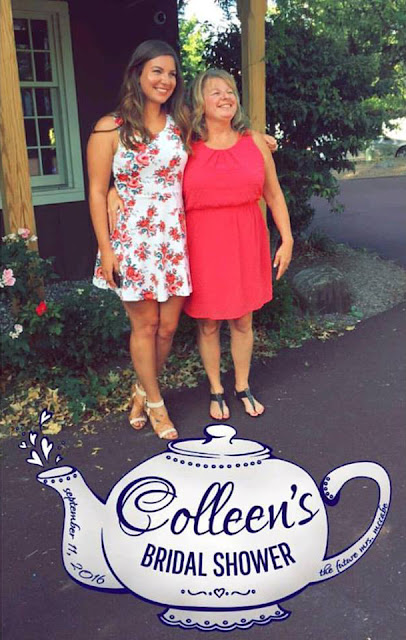
One of my favorite ladies is getting married October 15th and I have the honor to stand up there with her as one of her bridesmaids. This past Sunday we held Colleen's Bridal Shower at the Lederach Tea Room. As one of my small gifts I wanted to design a Snapchat Geofilter for the event. Per usual, it all started as a sketch. I wanted to make it delicate and feminine and fit the tea room theme. I included the date of the shower and "The Future Mrs. McCabe". Below is the sketch (please forgive the poor photo quality), the vector art, and the final filter put to the test! What a huge success for such a small design.


September 12, 2016

Yourn Nonce

Again, it has been a while since my last post, but I promise it is not due to a lack of design work! In fact, my workload has been a bit crazier and seems to get crazier as the holiday season approaches. Last month I had the privilege to do a logo design for a friend's vintage brand: Yourn Nonce. The brand has seen great growth since it started, and I am a big fan! With events approaching, Yourn Nonce needed a logo and some solid branding. 

My friend and I used Pinterest to collect ideas so I had a starting point for what she was looking for. She collected various script letterform ideas and borders she liked. With that I pulled out my pens and paper and got to drawing. When a designer gets a job that they really believe in, they dive right in and it makes it even more enjoyable. This was that project for me. My normal routine is surrounded by the automotive world and generally has a sturdy, masculine undertone. This was quite the opposite, and it is so nice to have those breaks now and then. I had a lot of creative liberty and got to work. Below is the result of micron to paper.


I drew each letter individually, knowing that the spacing wouldn't be perfect in the drawing. I wanted to make sure I had room for all of the added elements as they came to life. From there I brought the letters into Illustrator and did a quick image trace. Overall it translated quite well and needed a few touchups. I proposed the idea and my client happily approved! There's always some question in whether the client will be onboard with your idea and final product, as I had with this one. At the same time, I enjoyed drawing the letters so much that I had confidence she would also like them. If she ended up not liking them, I still had fun in the meantime! Luckily I was good to go and clean up was all that was needed for this part. Below is the final "YN" logo vectorized and polished.


Once I had that completed and approved, I wanted to use those letterforms with the current brand font to create the full Yourn Nonce Logo.


In addition to those two designs, I also wanted to design a more simplistic version of the letterforms for additional applications. While keeping the overall style, a more simplistic version could be needed for other forms such as a rubber stamp, vinyl, etc. Below are two additional versions of the YN, based on the original drawing.


I also made the two simplified versions with the full Yourn Nonce lettering. A final request to include a border with the YN logo was made and I referenced the Pinterest board of inspiration. Below is the final with the border.


Again, I am very happy with how this package turned out, as was my client, so it was a complete success. Additionally I made white PNG versions and will work on adding a pop of color to the brand. In the meantime, please check out the branding and the Yourn Nonce Vintage store here: Facebook |  Store

Finally, below is an animated gif of the letterform progression just for fun!


September 01, 2016

September 1st

How has it become September 1st? It's wild to think that it's Labor Day weekend and summer is ending. I've had so many adventures this year, and I am not quite done yet. I've traveled to well over 15 different cities in at least 11 different states within 7 months and I am currently on my flight to Flint, Michigan to run around the state with one of my favorite people. I've been looking forward to this trip for quite a while now. There's just something intriguing about playing dress up for a wedding one day and then waking up the next day to go play in the dirt at a race track. This weekend marks the pivot point from my hectic adventurous summer and begins wedding season. Stay tuned to see my fun creative wedding gifts I've been working on as well as updates from the notorious Baja Brawl.